
Megan and Nate had the food, the following, and the farmers-market momentum. What they didn't have was a website that looked like they did.
During the discovery call I mapped the founders' frustrations with their existing site against their goal: grow 86dsd from pop-ups into a full-time food business. They needed a platform more robust than WordPress to carry catering inquiries, orders, and brand credibility.
I proposed a focused redesign built on intuitive navigation, curated menus, and conversion-driven inquiry flows — capturing the authentic ethos of a San Diego food brand without sanding down its grassroots energy.
Items lived in image posts. Customers asked the same three questions in the DMs every week.
No structured request form meant high-intent inquiries arrived half-formed, or not at all.
The truck had swagger. The site had stock templates. The gap cost them credibility.

Proposal → beta identity → build → ghostwriting → handoff.
I pitched the redesign as a business case, not a mood board.
The proposal deck framed the work around three things the founders already cared about: user friendliness, conversion, and storytelling. Getting alignment there made every later design decision easy to defend.


Bold without losing its street roots
Chili red for action, chartreuse for energy, warm paper so food photography stays the loudest thing on screen.
A poster-weight grotesque for volume, an editorial serif for the menu — the same contrast the food has.

Partnered with a fellow designer on the mark, advising on palette options as the identity evolved.
Light or dark? I let the food decide.


Both versions shipped to the founders in beta. The light treatment won for the About page — it kept the founders' photos warm — while black stayed reserved for the menu, where the food had to pop against nothing.
Landing, About, Menu, Locations, Catering + Inquiry — designed in Figma, built in Framer, written by me.
Landing page
Strong typography, high-contrast color, and immersive food photography. Streamlined layout, clear navigation, strategic CTAs pointing at ordering, catering, and the founders' story.


Menu & location
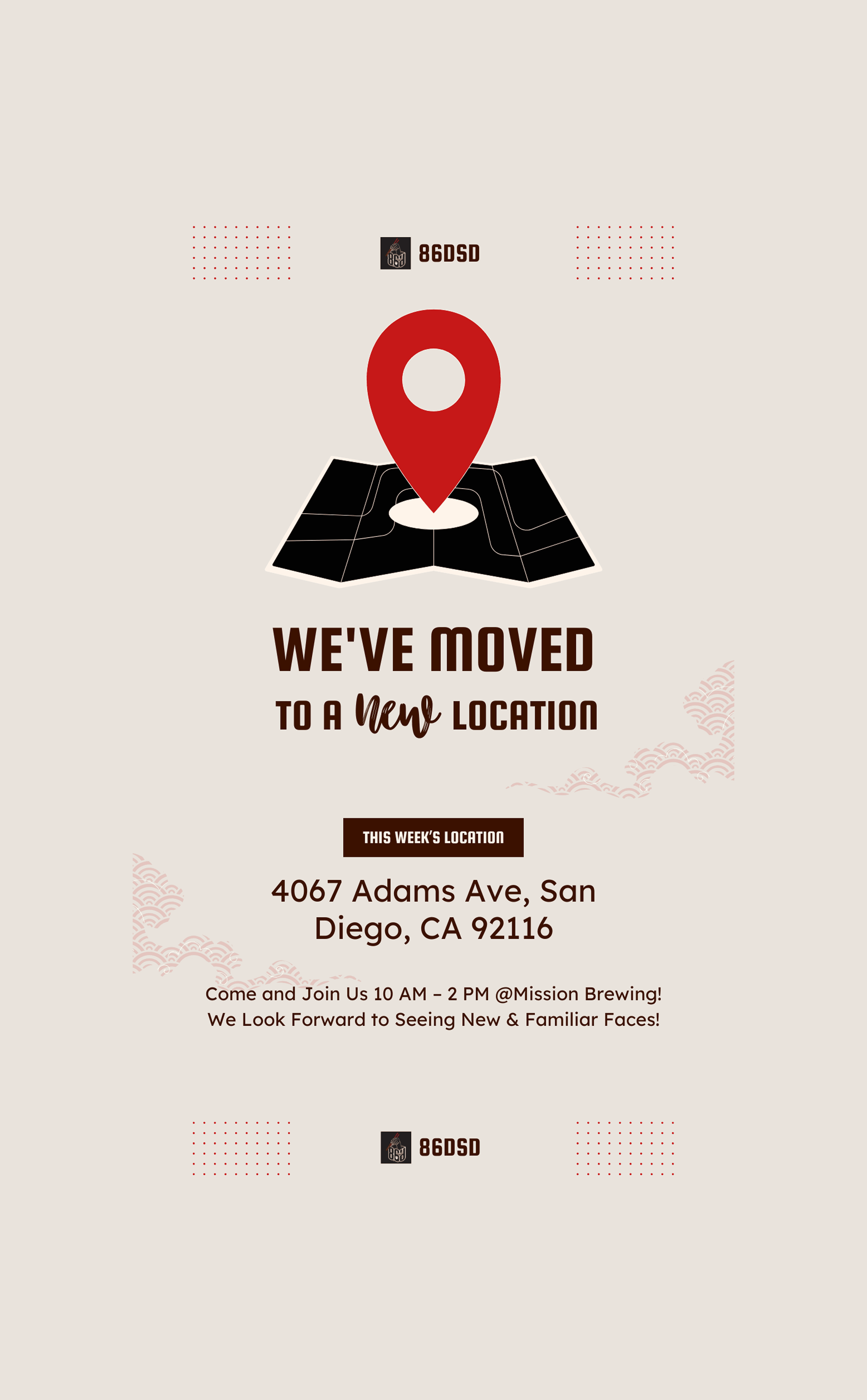
Built for speed and adaptability so a pop-up schedule can change weekly without a redesign. I ghostwrote every dish description to match the brand's voice.


Catering & inquiry
Designed to minimise friction while capturing high-intent leads: clear input hierarchy, mobile-first layouts, and only the fields the team actually needs to quote a job.


86dsd found a permanent home in North Park. The site came with them.
Domains transferred, 30 days on retainer, and a Framer build the founders can update between services. What started as a pop-up presence is now a growth-ready brand rooted in community and craft.

Key takeaways
A clear, confident foundation — strong visuals, obvious navigation, direct CTAs — beat sweating details nobody would notice.
People eat with their eyes. Commissioning real photography did more for social proof than any layout change.
Ghostwriting the menu proved tone and hierarchy shape trust as much as the visuals wrapped around them.
Eight weeks, two founders, one designer. Every scope cut forced a clearer answer about what the site was actually for.

home

life lately
schedule a call
what did i forget?

routing adventures

get to know me

vibing to
currently working on
see my projects :)

let's connect!


send a message
resume

drafts