
Modern Wisdom
A dedicated mobile experience built to support focused listening, reflection, and lifelong learning.
Project Overview
Client: Modern Wisdom, podcasting platform
Industry: Media & Entertainment
Timeline: 8 weeks (2024) & 4 weeks (2025, Revisit)
My Role: Product Designer & UX Researcher
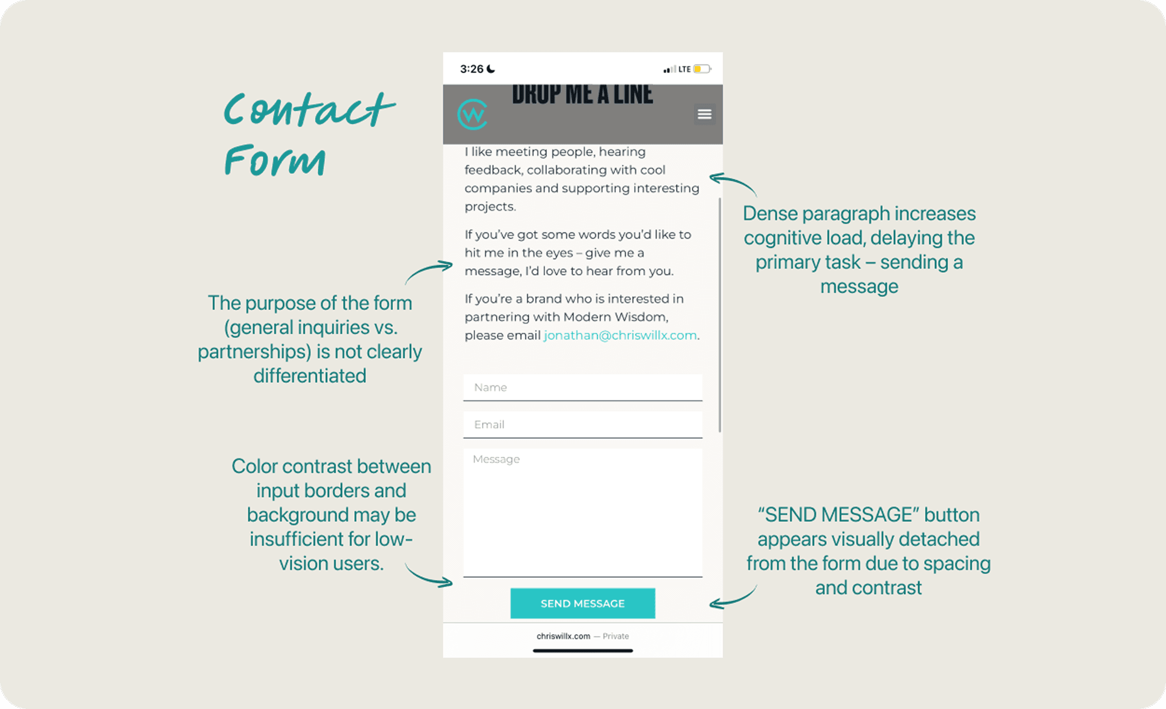
The Challenges & Purpose
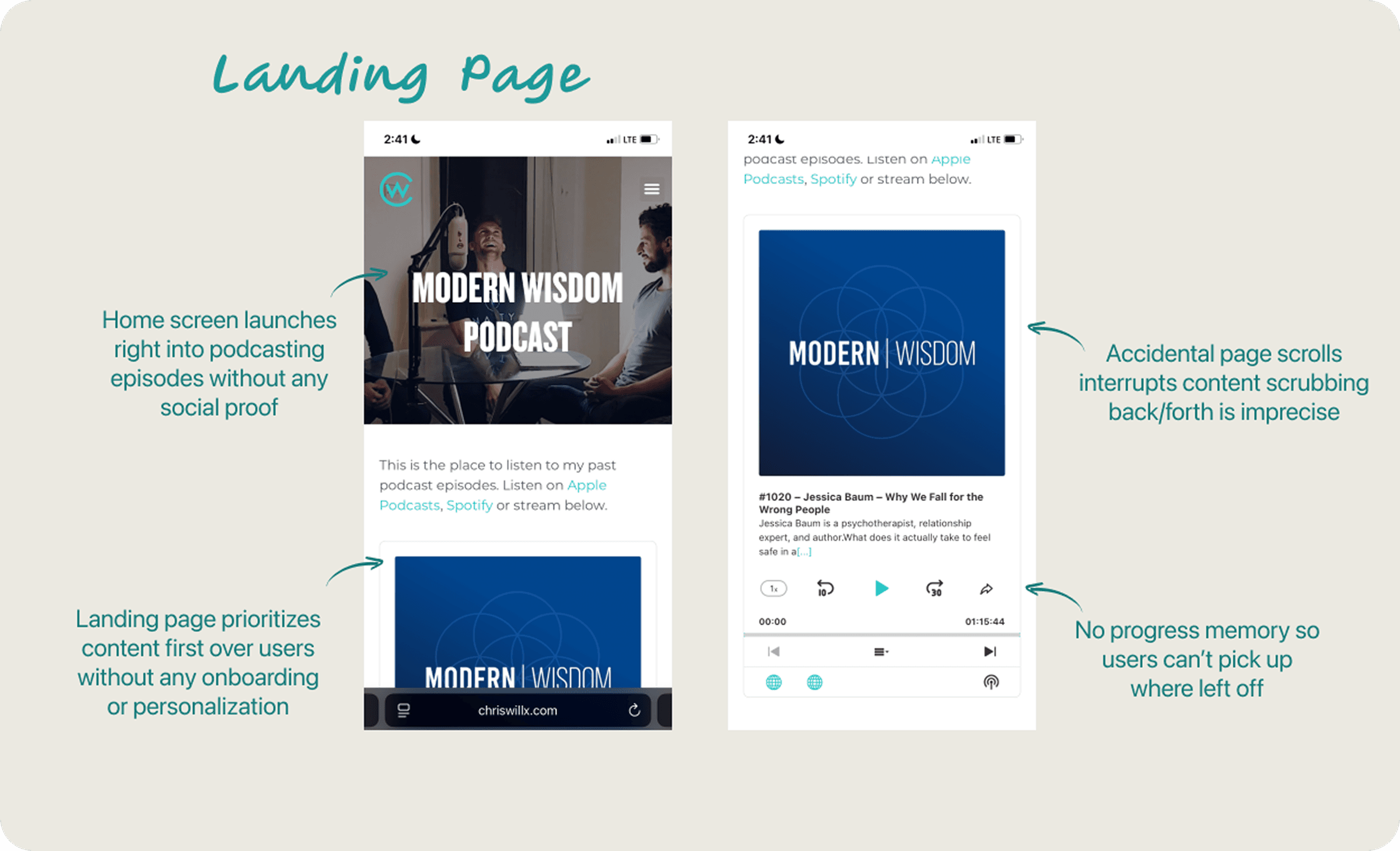
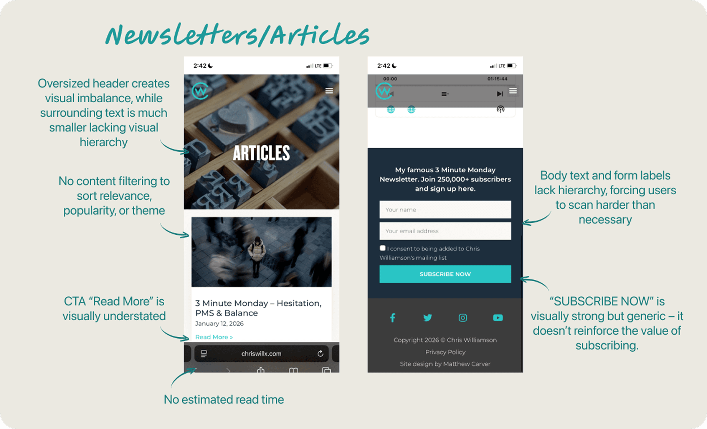
Modern Wisdom’s mobile web experience introduces friction through buffering, limited playback controls, and a lack of saved progress or playlists- disrupting deep engagement with long-form content.
The Final Product & Impact
A dedicated mobile app that centralizes Modern Wisdom’s podcasts and essays into a focused, distraction-free experience. Features like seamless playback with saved progress, curated playlists, and unified access to articles reduce friction and support deeper, more intentional engagement.
My Role & Responsibilities: Sole Product Designer & UX Researcher
As the sole Product Designer and Researcher, I owned the end-to-end product design and research, shaping the product vision, structure, and final experience.
TL;DR
Redesigned Modern Wisdom into a focused mobile app that centralizes podcasts and articles, enabling users to save progress, curate content, and return seamlessly- transforming passive listening into intentional learning.
The Design Process
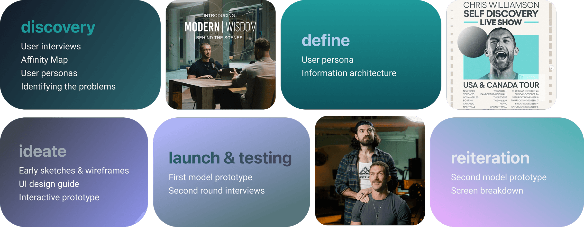
Phase 1 – Discovery 🔍
Methodologies & Research Goals
I used product audits, competitive analysis, and user interviews to identify gaps in discovery, continuity, and re-engagement.
User Interviews 🗒️
I asked listeners open-ended questions to maximize flexibility in their answers and thus understand and gauge the user’s psyche:
Questions:
What are some of the features that you enjoy about the Modern Wisdom website?
What are some features that you’d like to see improve on the website?
What do you look for when going on Chris Williamson’s website?
How often do you read Chris Williamson’s articles? How often do you listen to his podcasts?
& Respective Findings
Affinity Diagram
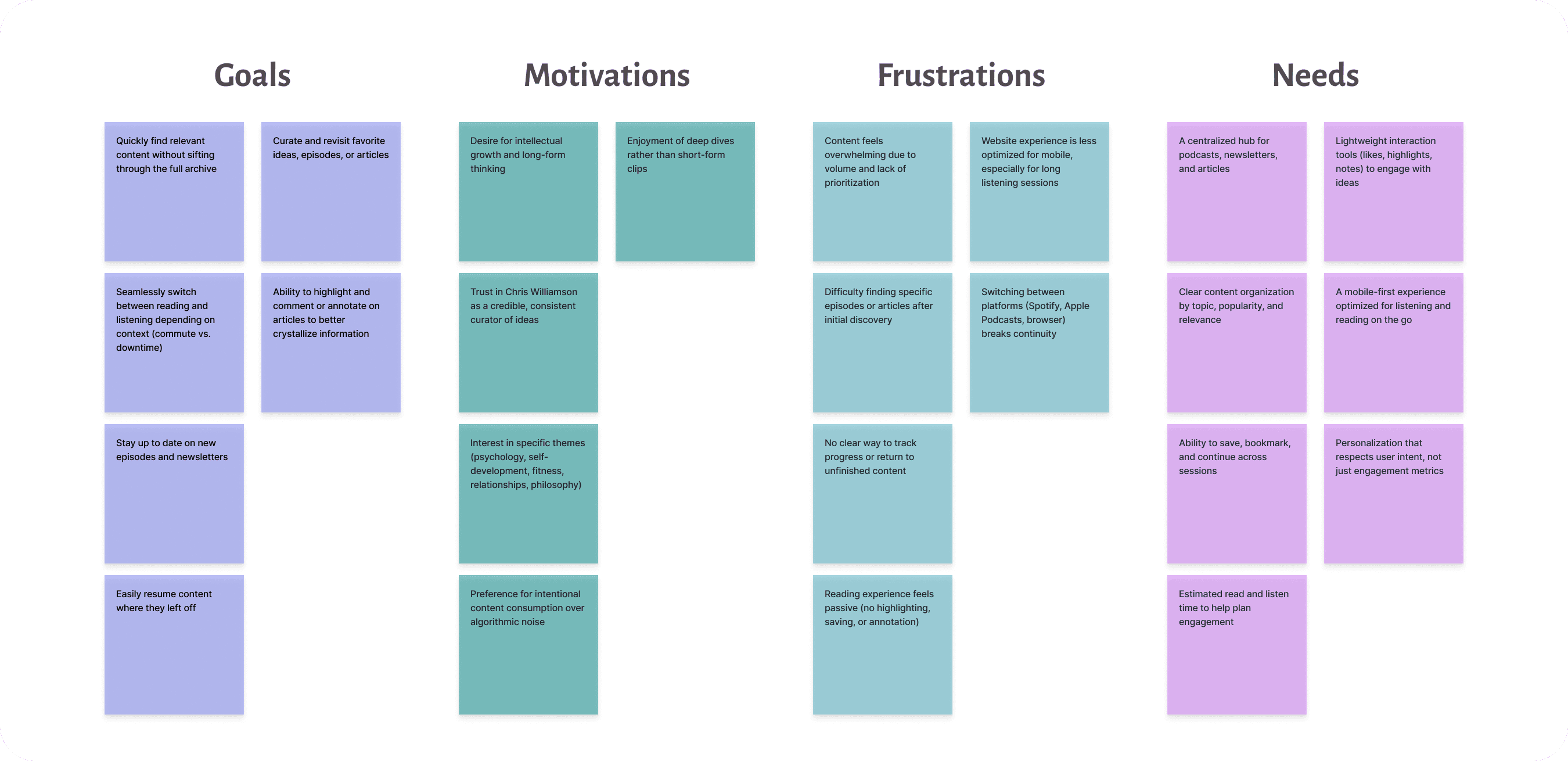
Some Notable Insights 📌
Users listen to podcasts more frequently than they read articles
Articles are often saved later rather than read immediately
Users return to the site when they are in a “focused mindset”, (aka deep cleaning, work, etc)
Trust in Modern Wisdom leads users to explore topics outside their original intent, but only when content feels personalized
Breaking Down the Problem [temp]
Phase 2 – Define 💭
Understanding & Implementing User Insights
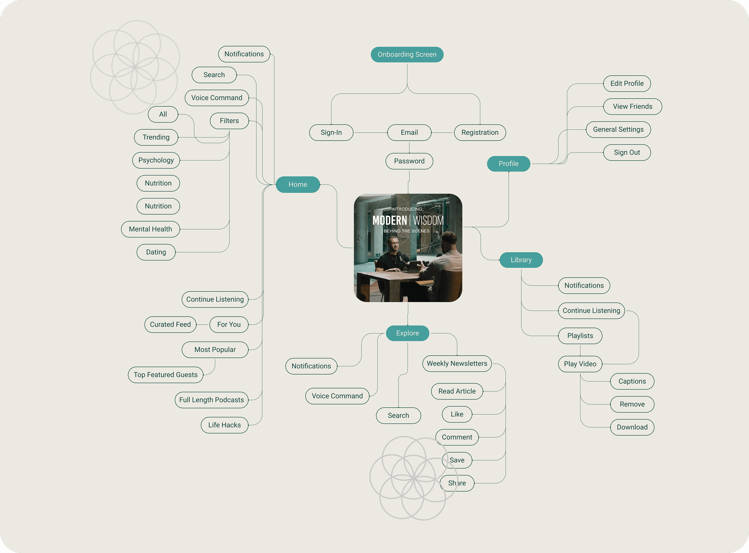
Sitemap
Laying the Blueprint
Phase 3 – Ideate
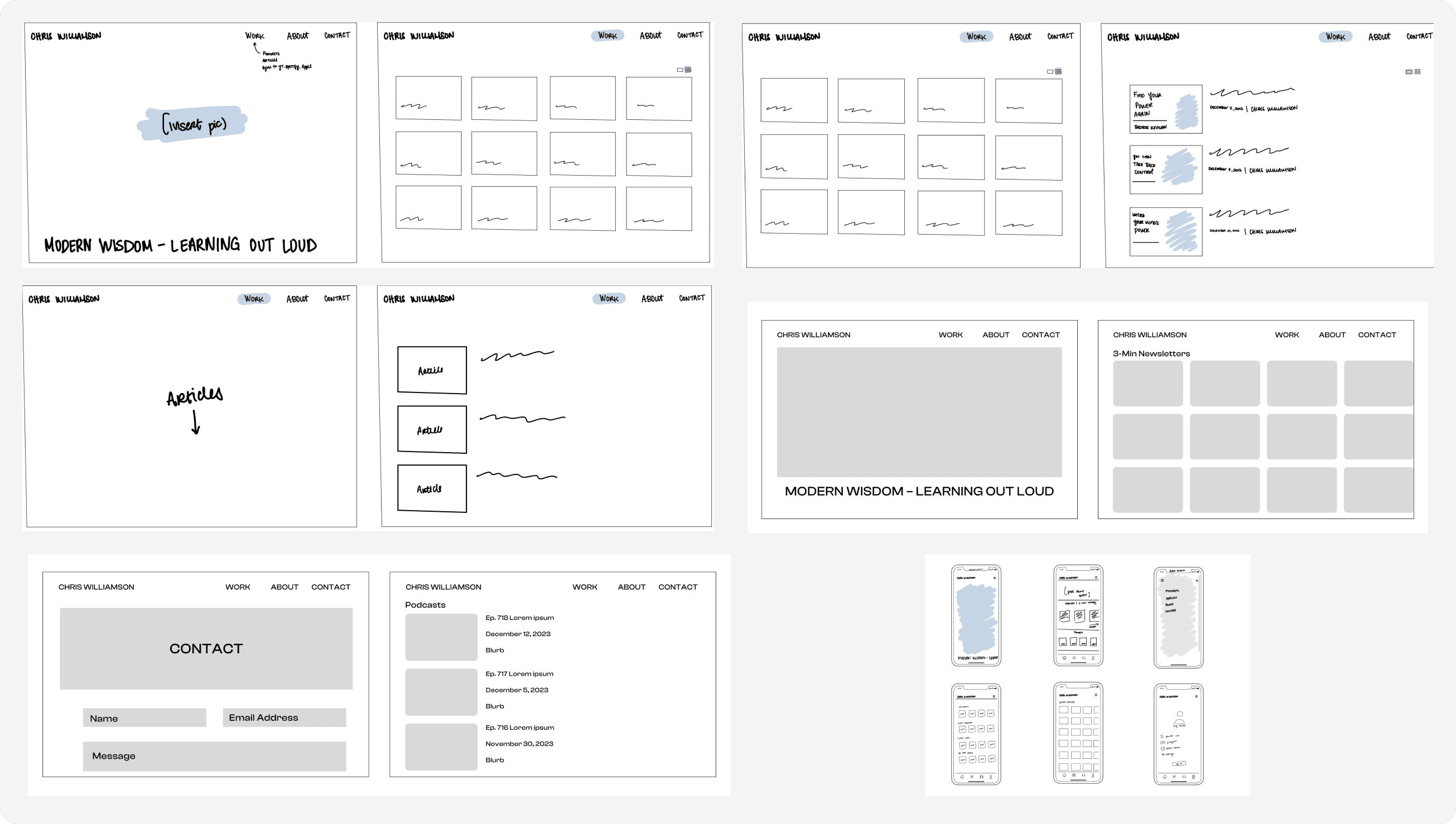
Early Sketches & Wireframes 🖋️
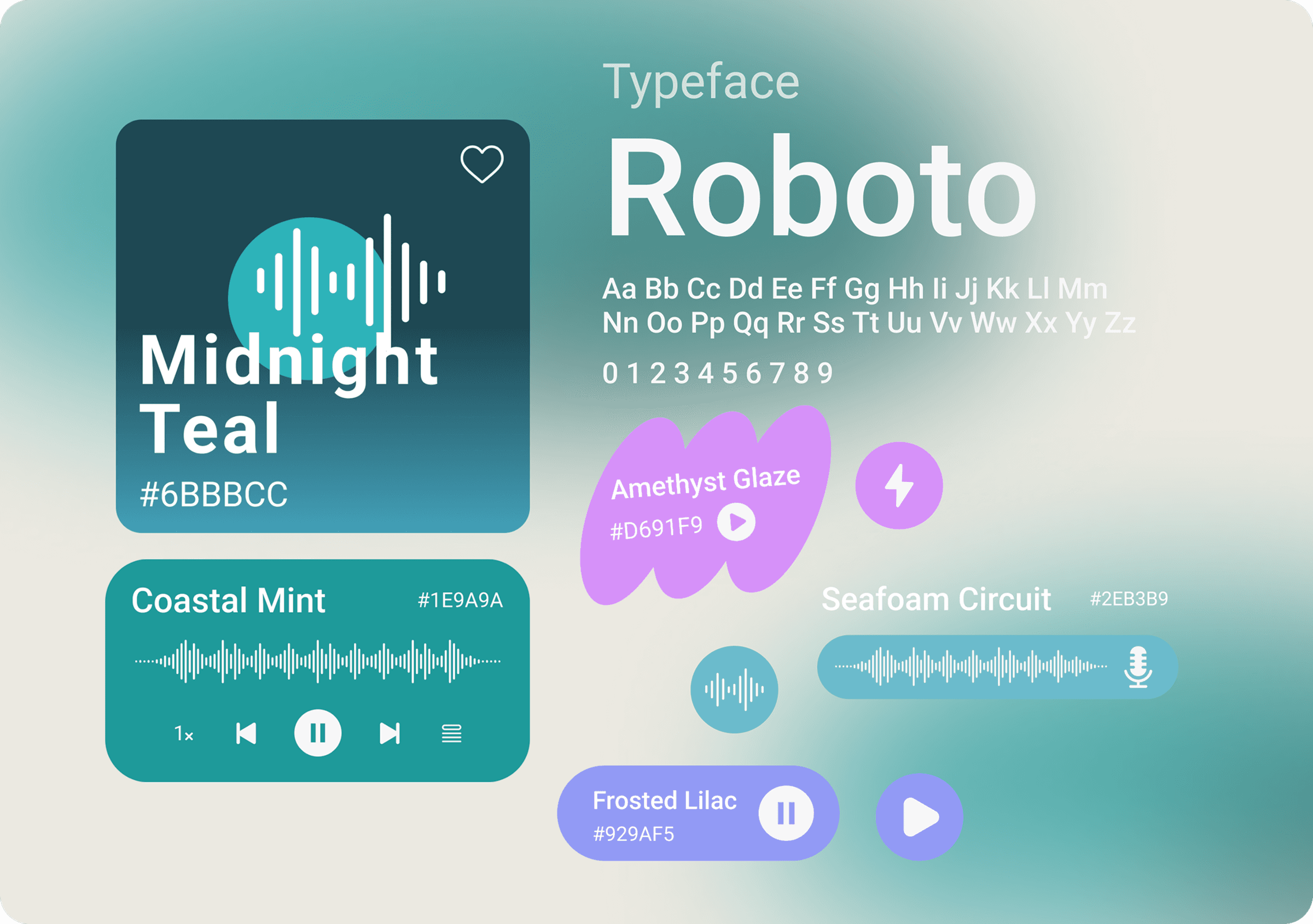
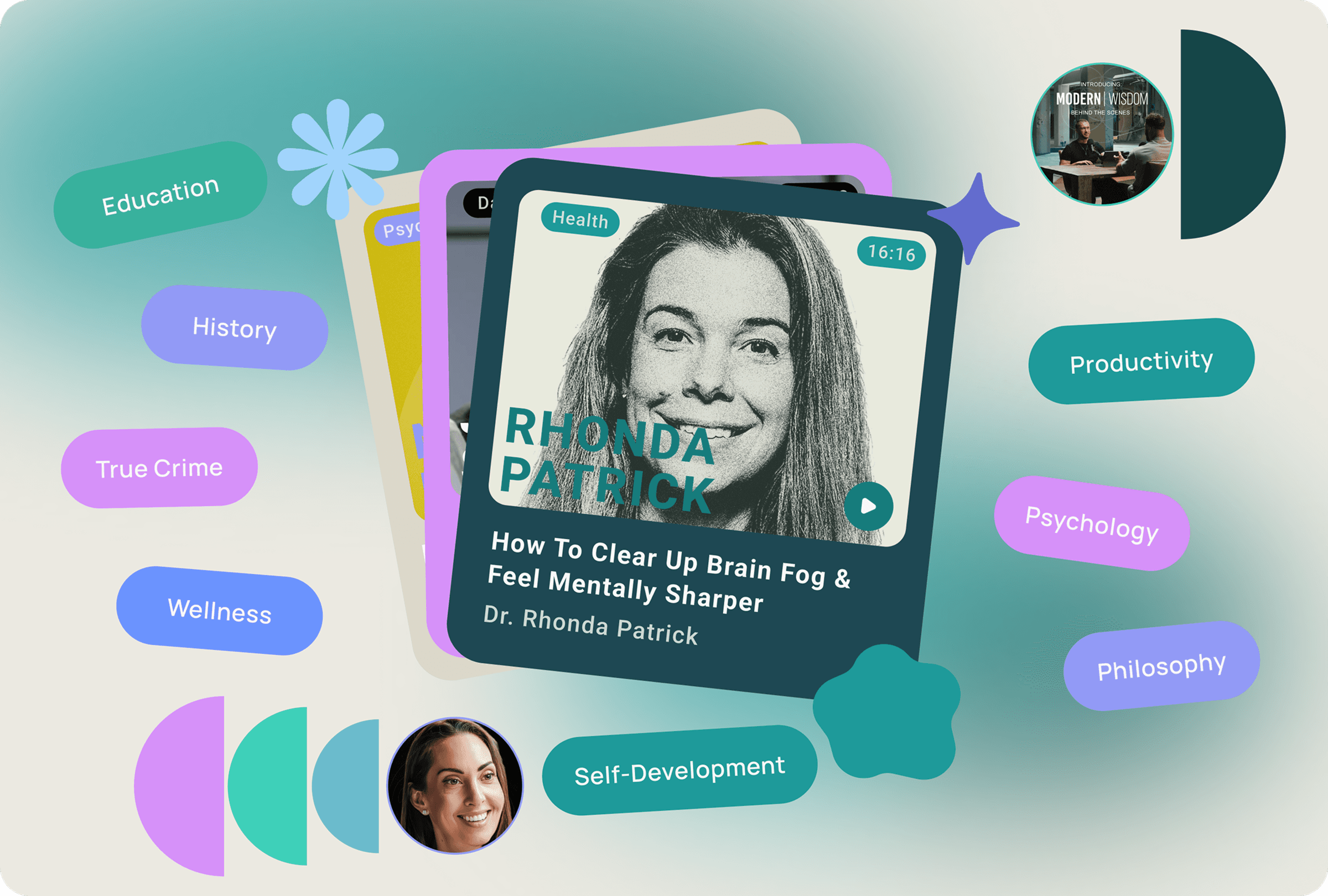
Typography & Color Palette 🧩
Initial vs. Final Design Guide
The initial palette leaned heavily on black, white, and grayscale, drawing inspiration from Modern Wisdom’s existing editorial and minimalist aesthetic. This approach established a strong sense of seriousness and intellectual credibility, aligning with the podcast’s long-form, thoughtful content.
However, in practice, the palette felt overly stark and emotionally flat in a mobile context. The high contrast between pure black and white created eye strain during extended reading sessions, while the lack of color differentiation limited hierarchy and scannability across the interface. As the product expanded beyond static content into a more immersive listening experience, the grayscale system proved too rigid for sustained engagement.
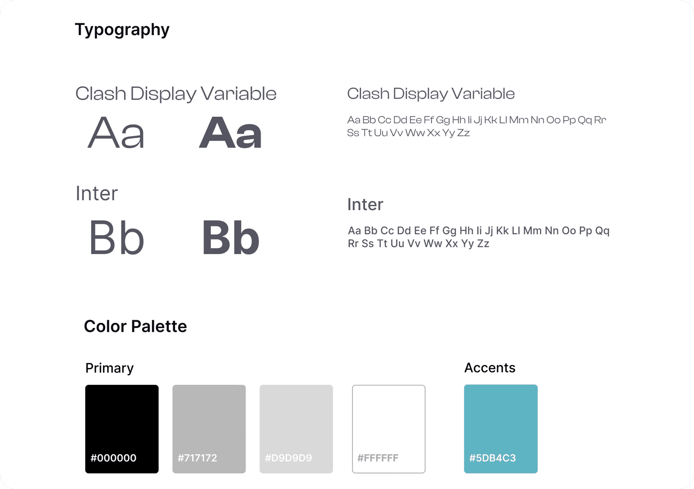
The final palette features soft neutrals, cool teals, and subtle lilacs enhances focus, readability, and accessibility while adding warmth without distracting from content.
Phase 4 – Launch & Testing 📱
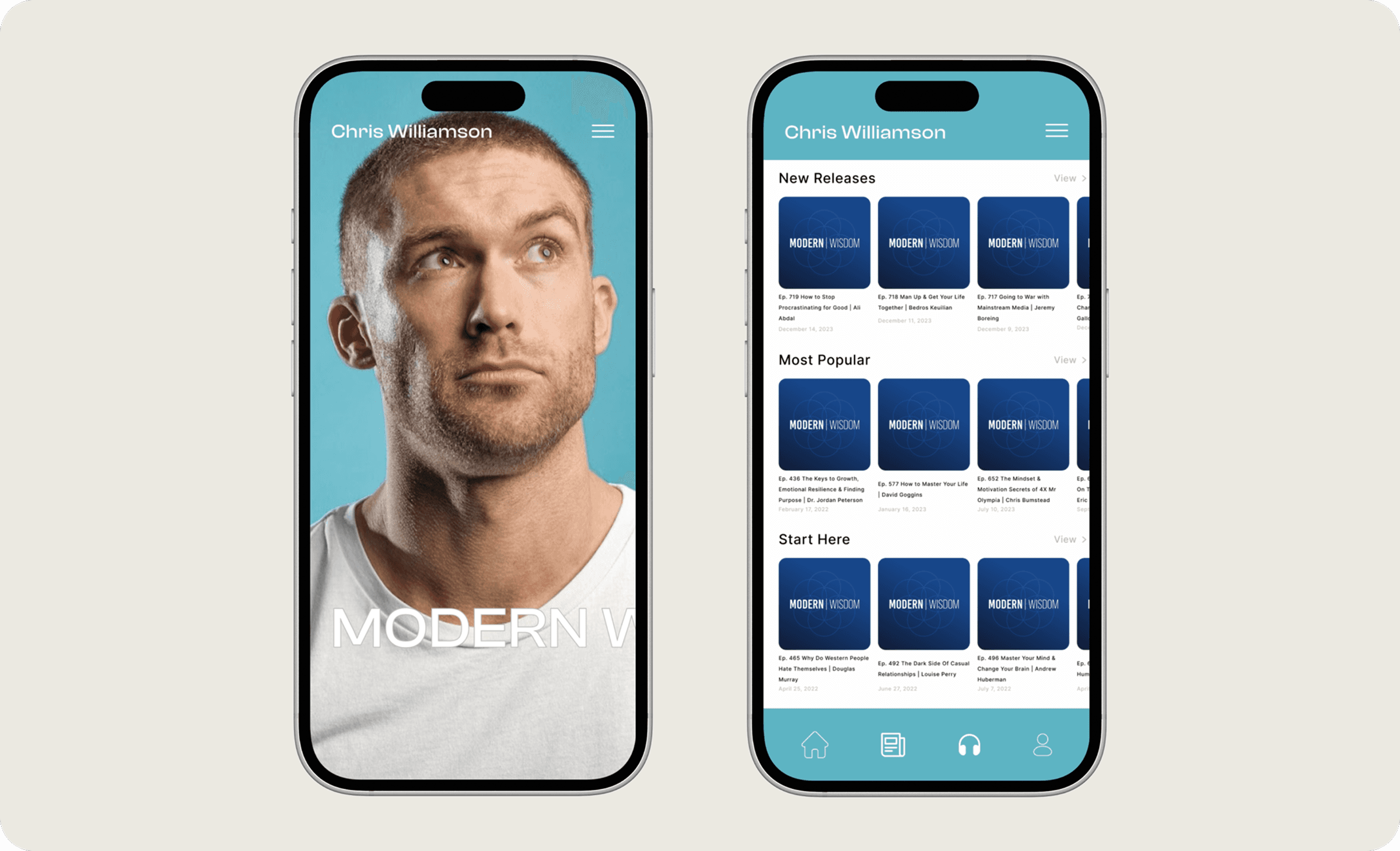
(Early Model) Prototype 1.0:
This early iteration centered on improving navigation and discovery without disrupting Modern Wisdom’s established identity.
Phase 5 – Reiteration//Revisit 👾
Prototype 2.0
I drew inspiration from journalistic platforms like Substack and Medium, which use interest selection during onboarding to give users a sense of control over their content. On top of that, allowing users to choose topics upfront creates a subtle commitment and ensures the content library feels curated by merging personal preference with recommended material.
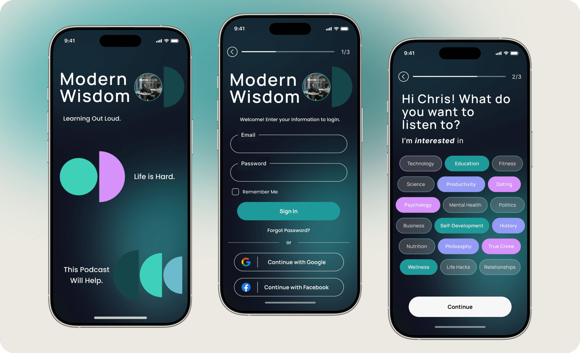
Welcome Screen
A minimalist opening that frames Modern Wisdom as a space for thoughtful exploration, not passive consumption.
Sign In
The login experience is designed to feel lightweight and straightforward with clear input fields, familiar authentication options, and clear visual hierarchy. Social sign-in options provide a faster path to entry, supporting both returning listeners and first-time users.
Interest Selection
Before content is even introduced, users are given the opportunity to personalize their experience by selecting topics they’re curious about – the full gamut of podcasting topics from psychology, and philosophy to fitness and relationships. According to my research, this step was absolutely crucial in setting expectations and allowing the app to recommend content that would cater to each user's taste. By centering user intent early, Modern Wisdom niches down on its large content library into a curated, personal feed.
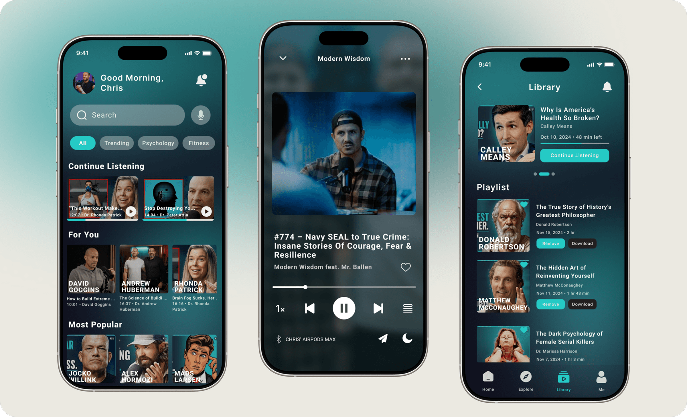
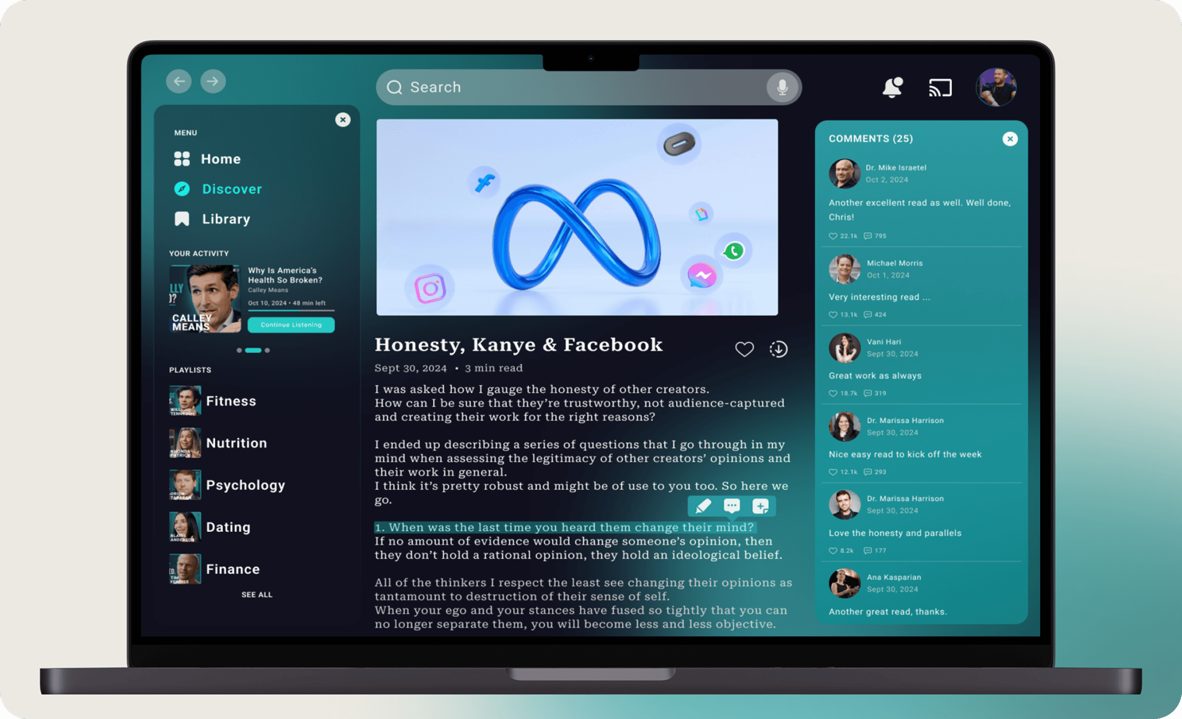
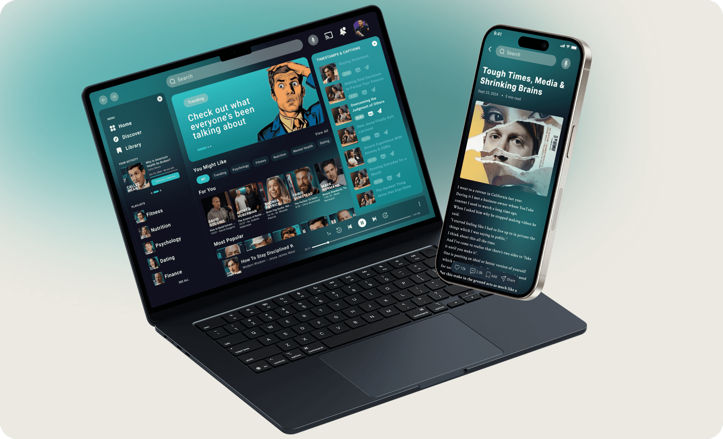
Discovery Feed
The Home screen is a personalized discovery hub, surfacing content based on listening history, interests, and trends, with search and filters to support quick exploration.
Now Playing
The Now Playing screen minimizes distraction, prioritizing clear playback controls for hands-free listening while keeping secondary actions subtly accessible.
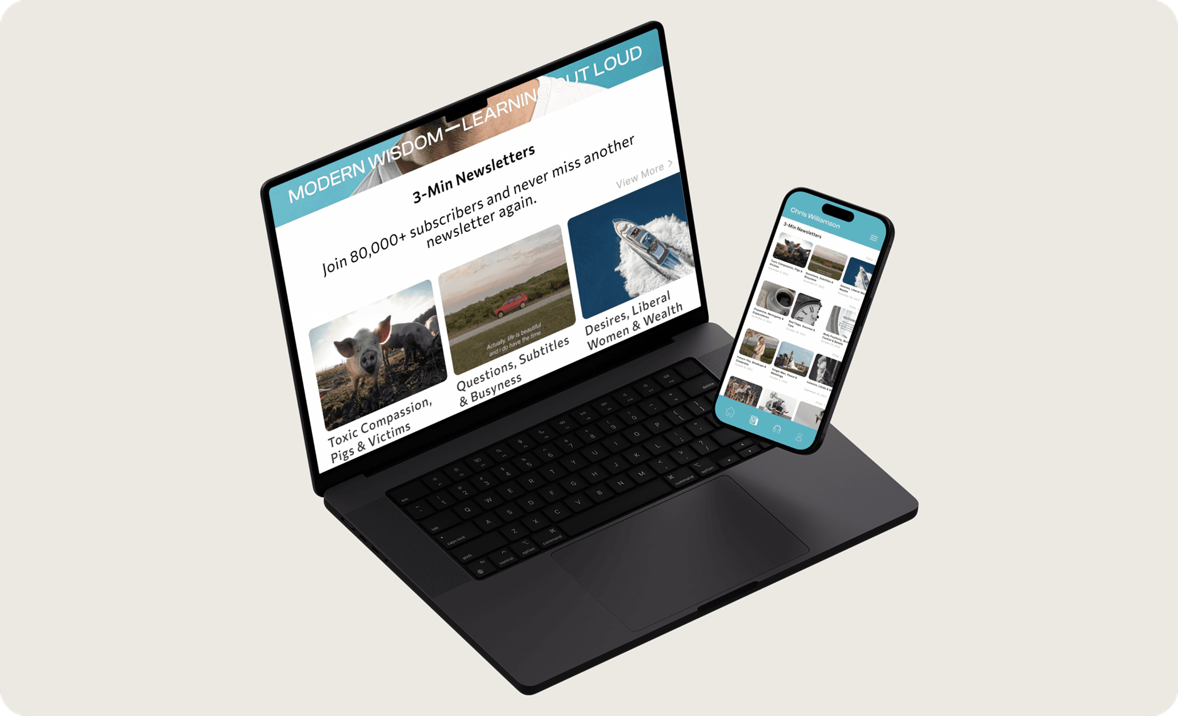
Library & Saved Content
The Library serves as a personal archive for saved episodes, playlists, and downloads, with clear hierarchy supporting quick resume and offline listening for long-form use.
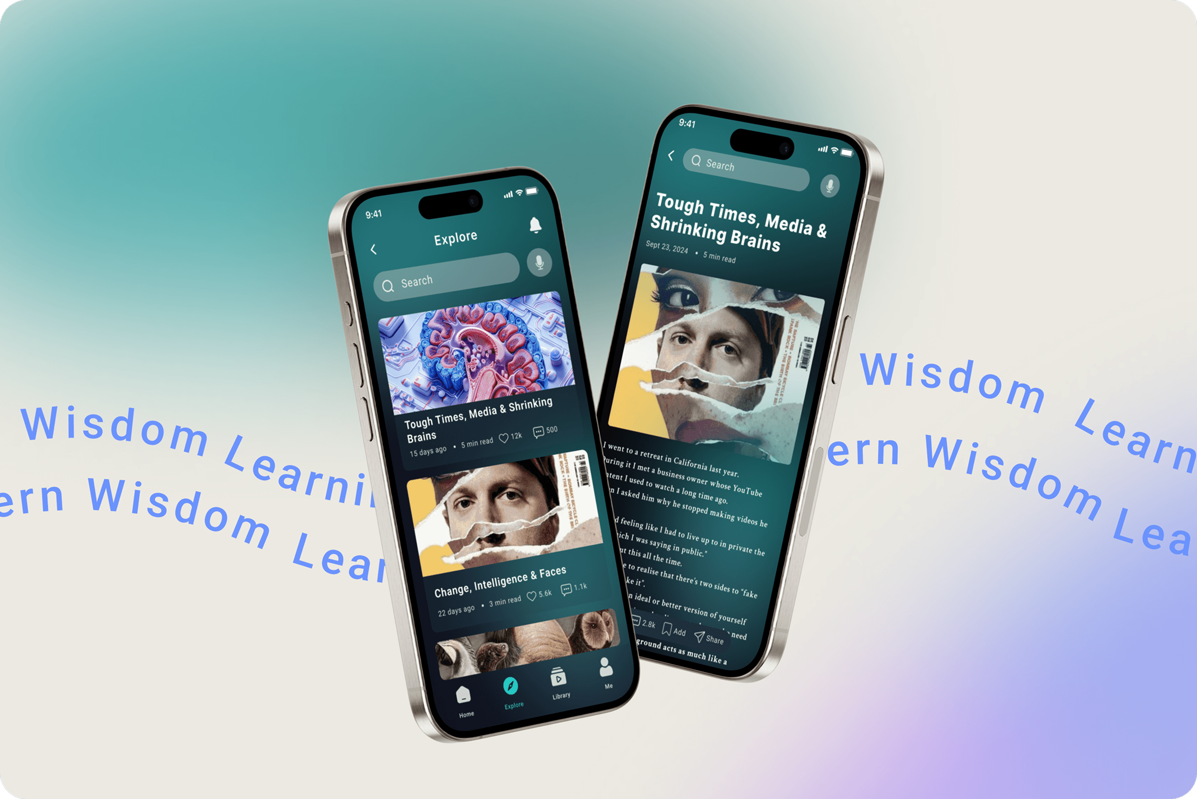
In addition, as requested by my research participants, a dedicated reading experience for Modern Wisdom’s articles and newsletters, featuring estimated read time, likes, comments, and in-text highlighting and annotations – designed to promote active reading and deeper engagement.
Reflections
Key Takeaways
With Modern Wisdom,, hosting long-form conversations across multiple formats poses the challenge of balancing depth with accessibility and ensuring users could easily discover and return to the content without feeling overwhelmed. The project reinforced the value of leveraging existing models (Spotify, Medium, etc) to reduce cognitive load with clear navigation and aesthetic interfaces that prioritize focus and intention. Ultimately, the project emphasized how thoughtful UX can enhance credibility and deepen user engagement without overshadowing the content itself.
What I'd Do Next
Collaborate with product engineers to identify feasability and tangible deliverables
Add UI controls for contrast, text size, and motion reduction to improve accessibility
Expand playlist features to allow users greater flexibility in categorizing their saved items