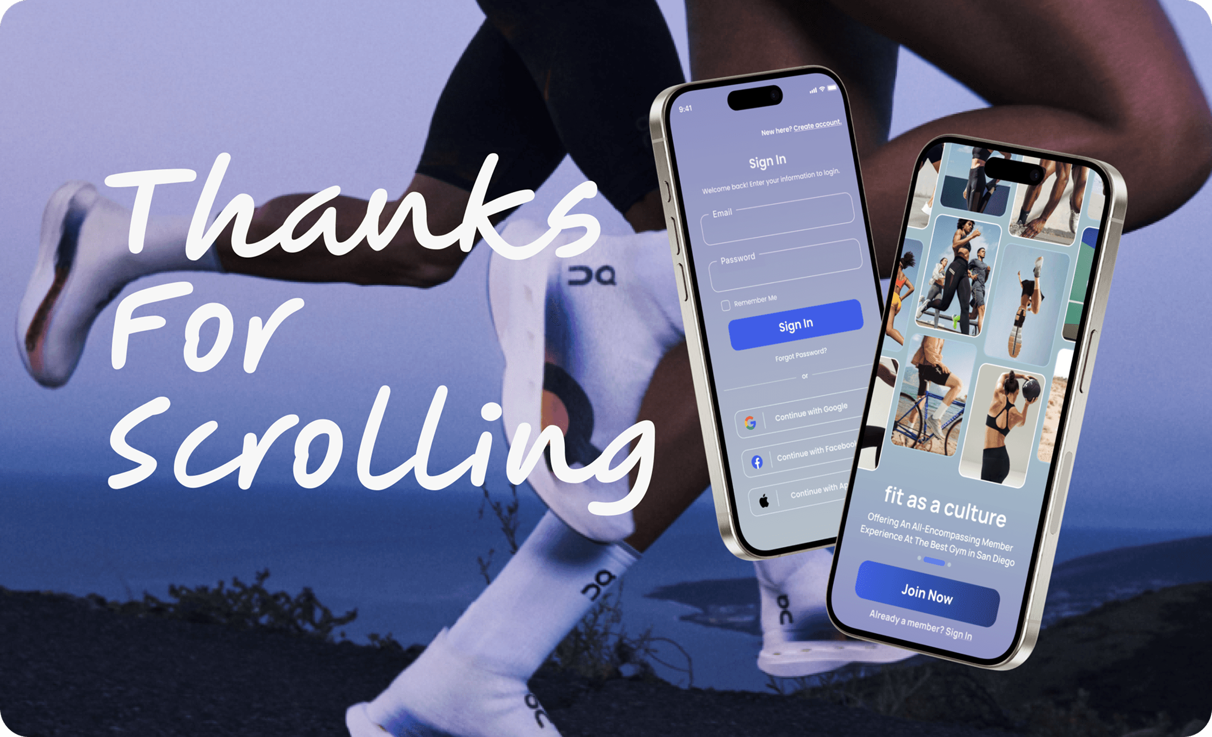
Fit Athletic Club
Mobile App Redesign Metrics: +32% faster tasks · 87% first-try success · 94% overall completion
ROLE
UX/UI Designer, UX Researcher
TIMELINE
16 weeks (2024-2025) & August 2025 – November 2025 (Revisit)
TOOLS
Figma, FigJam, Maze, Claude
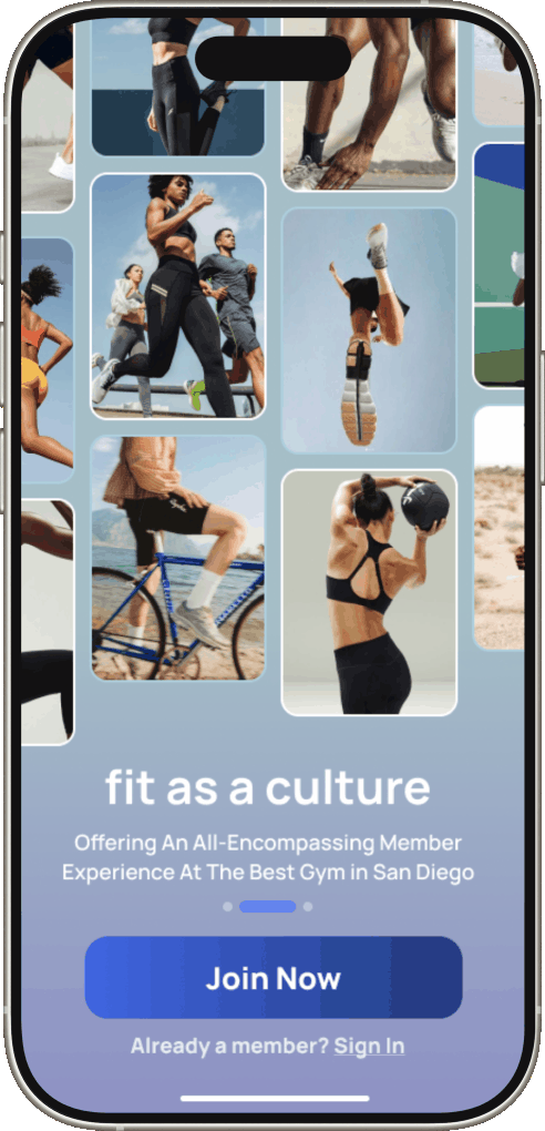
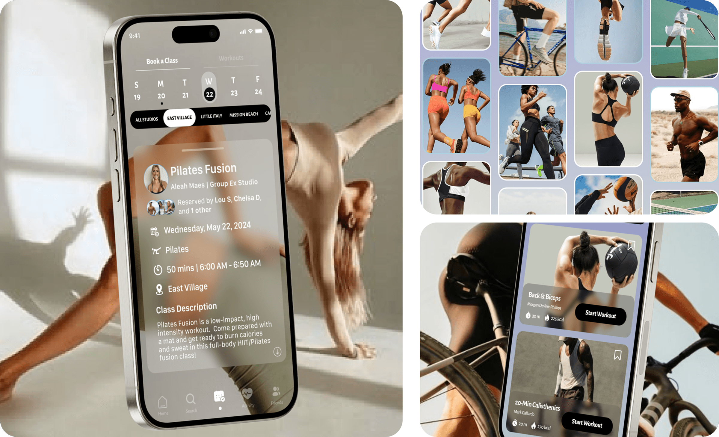
Fit's app did one thing: book a class. Members were using four different apps to track the rest of their fitness life. This project asked: what if the gym came with you?
The 36-Hour Sprint
As a personal challenge, I designed the Fit Athletic Club app from paper sketches to prototype in just 36 hours. I treated this phase as a sprint – iterating quickly, embracing imperfect decisions, and avoiding analysis paralysis, with the intention to refine later.
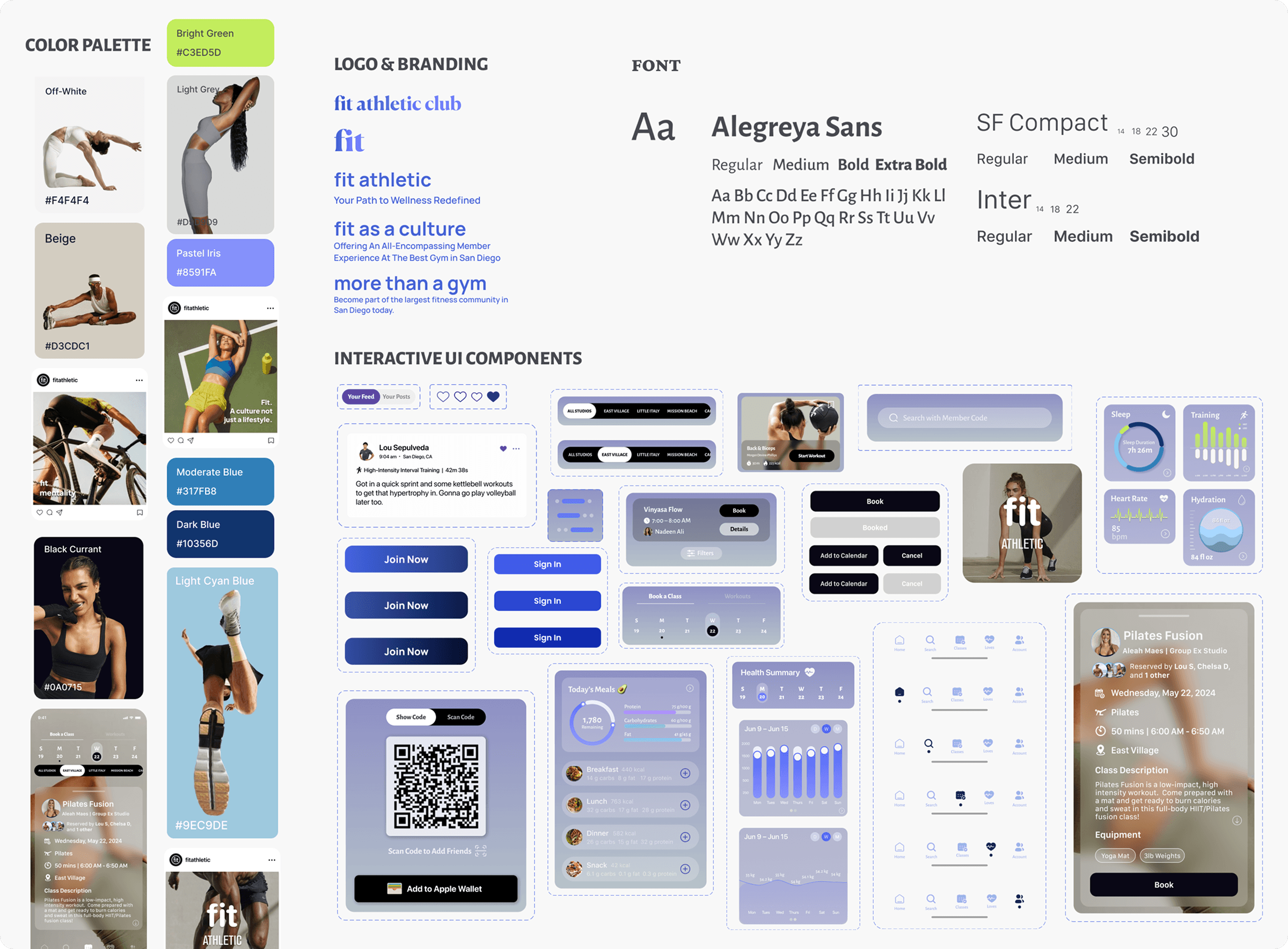
Grayscale felt too stark for Fit's energy. I landed on a sunrise-to-sunset palette, neutrals layered with blue, purple, gold, and green – flexible enough to scale as features grew.
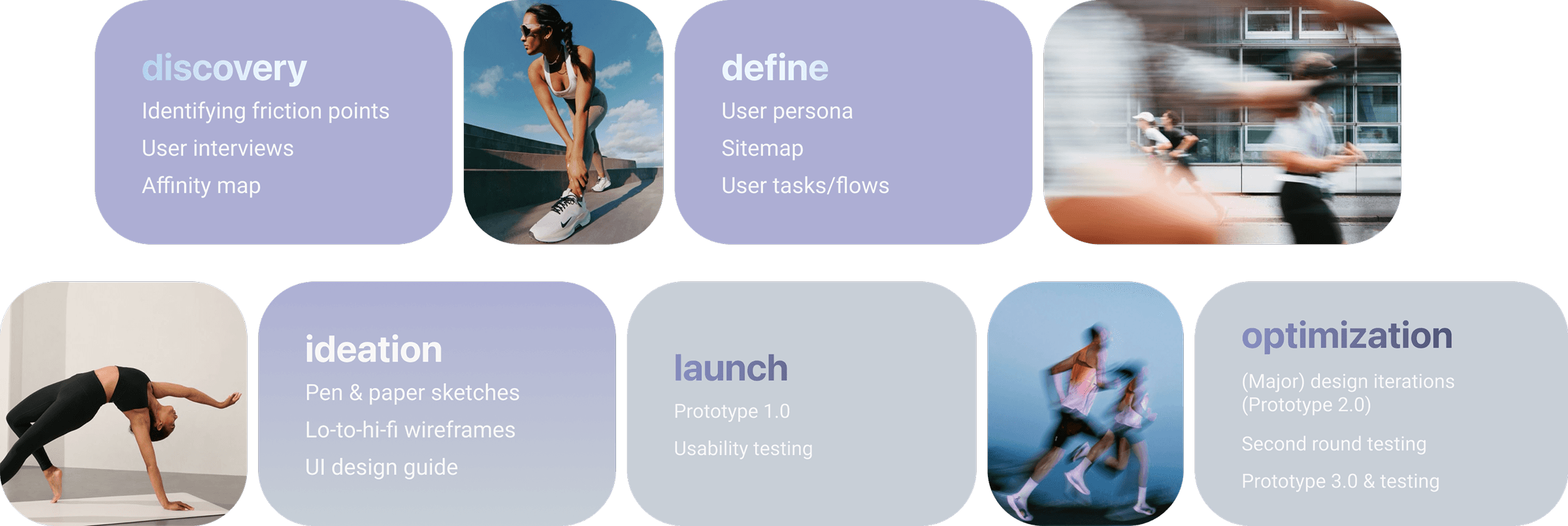
Identifying the Problem
With the fitness app market highly saturated, I audited Fit’s mobile app to identify usability gaps and benchmarked findings against best-in-class platforms like Nike Training Club and Peloton. The goal was to prioritize high-impact features, refine existing ones, and remove friction- while maintaining a lean, feedback-driven design process.
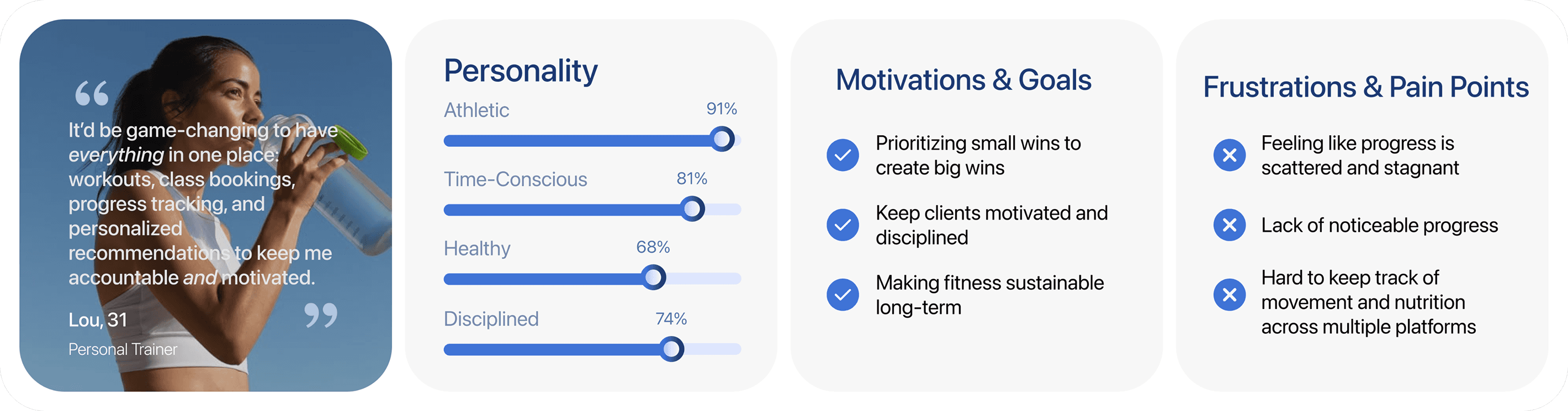
User Interviews
I conducted user interviews with 8 participants who attend Fit Athletic for an average of 3-5 times per week, have used similar training or fitness apps (NikeTrainingClub, Strava, MyFitnessPal, Peloton, ClassPass, Oura, Trainerize), and have explored all the features of Fit's current app. Through the interviews, I was able to discern each participant's motivations and pain points while using Fit's current mobile app versus other fitness apps as well as future desired features that would enhance their fitness journey.
Affinity Diagram
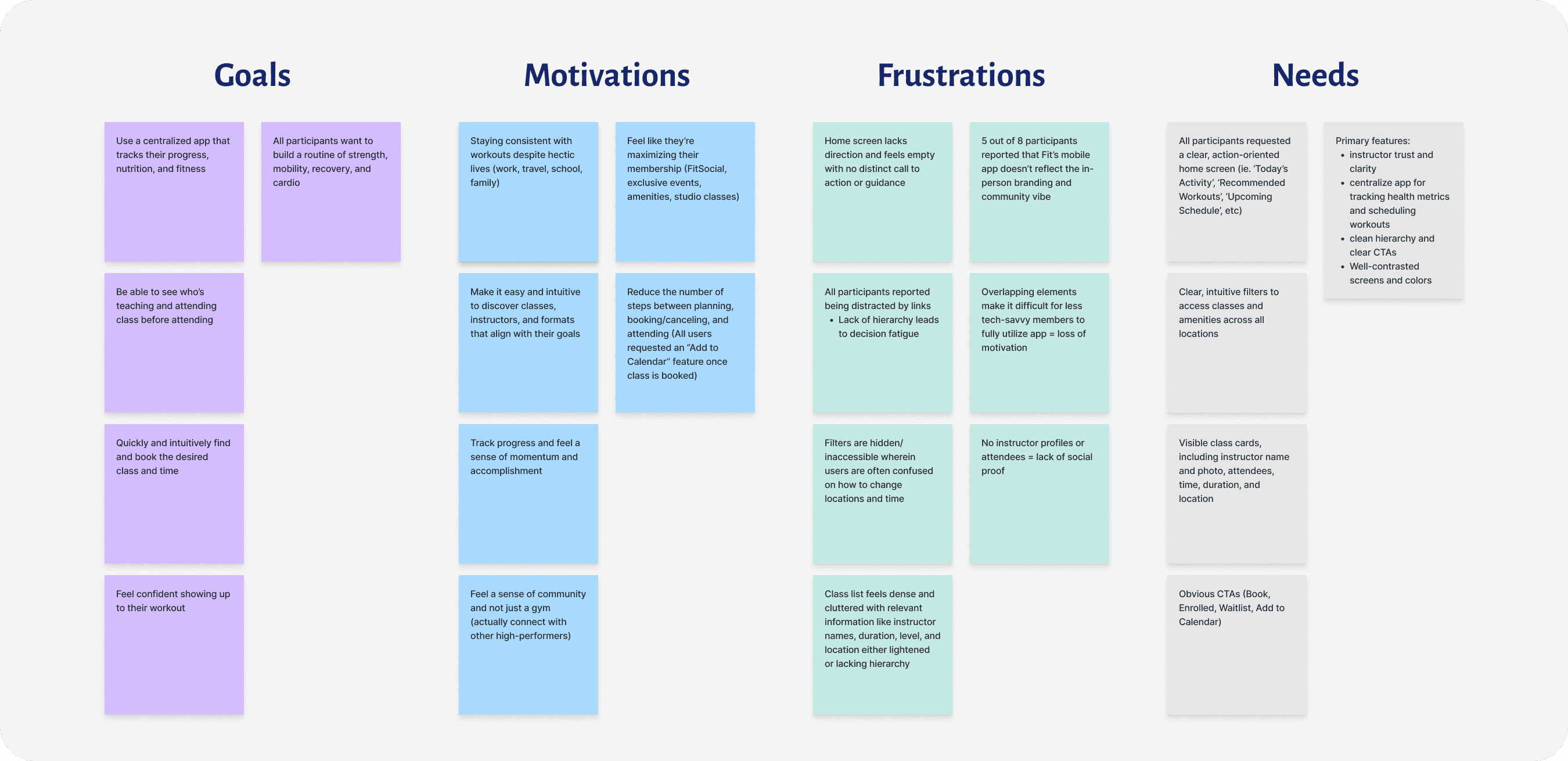
Understanding & Implementing User Insights
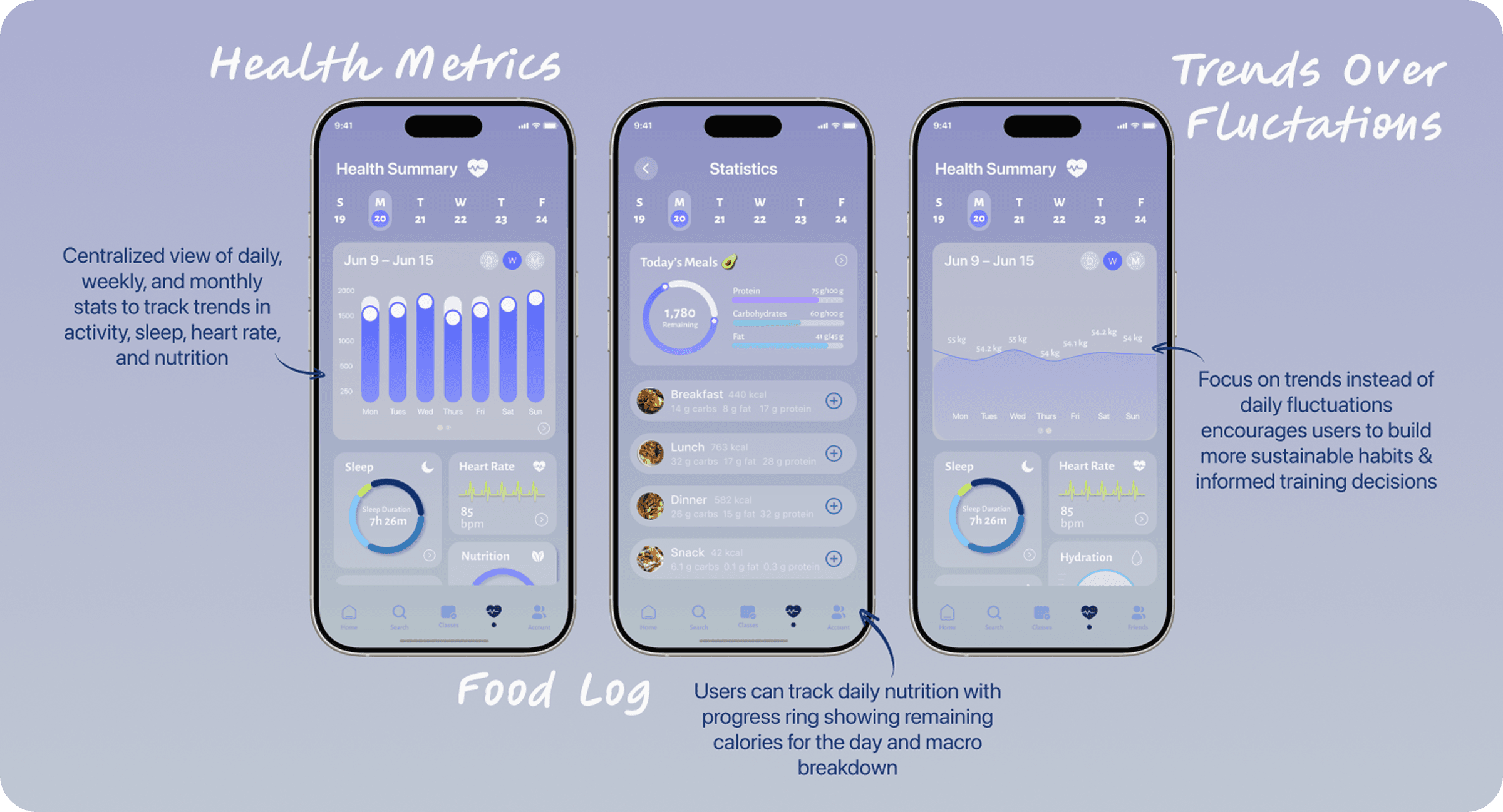
Research focused on understanding user behaviors and pain points to design an intuitive, immersive experience that streamlines fitness routines and promotes long-term consistency.
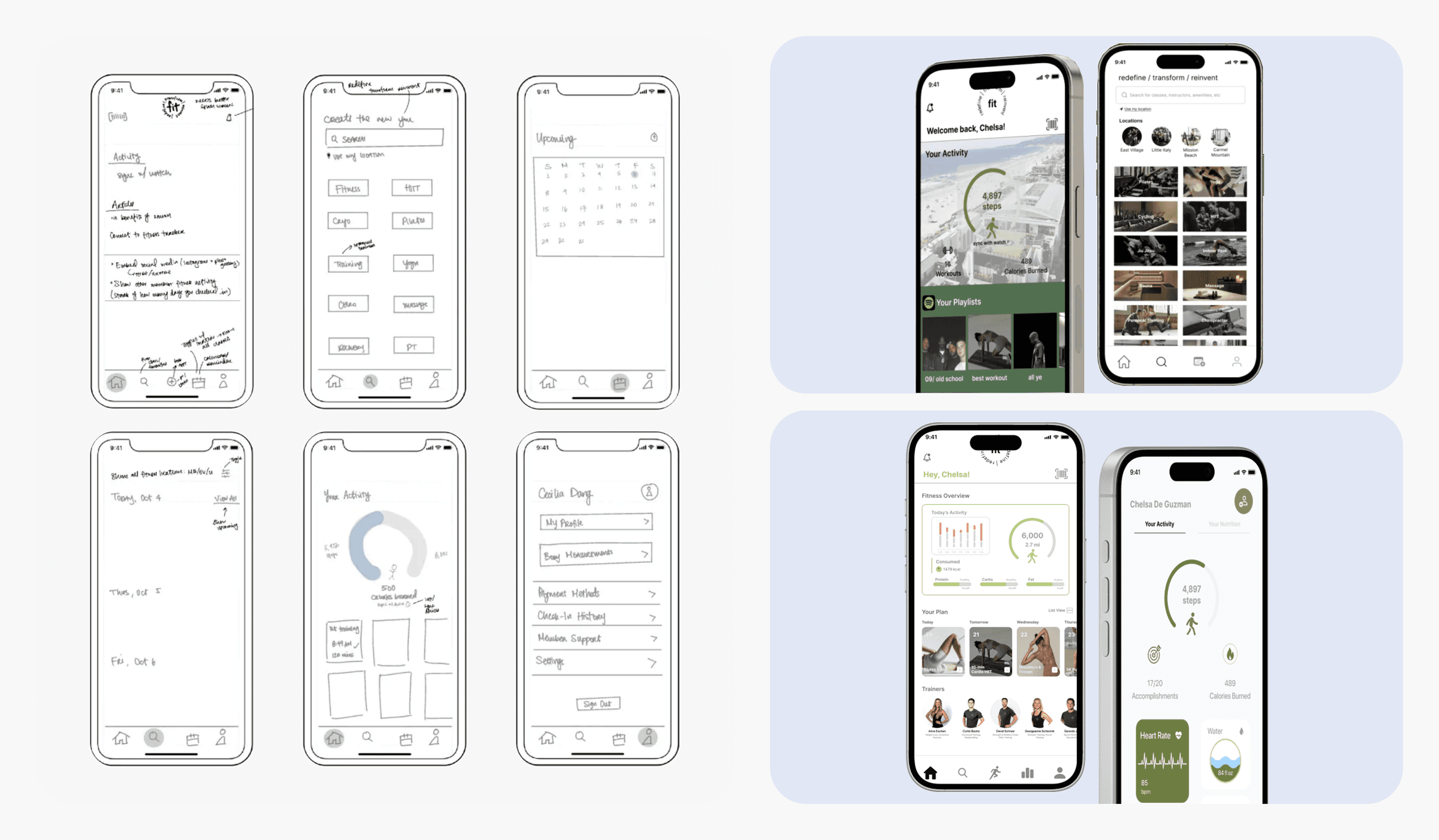
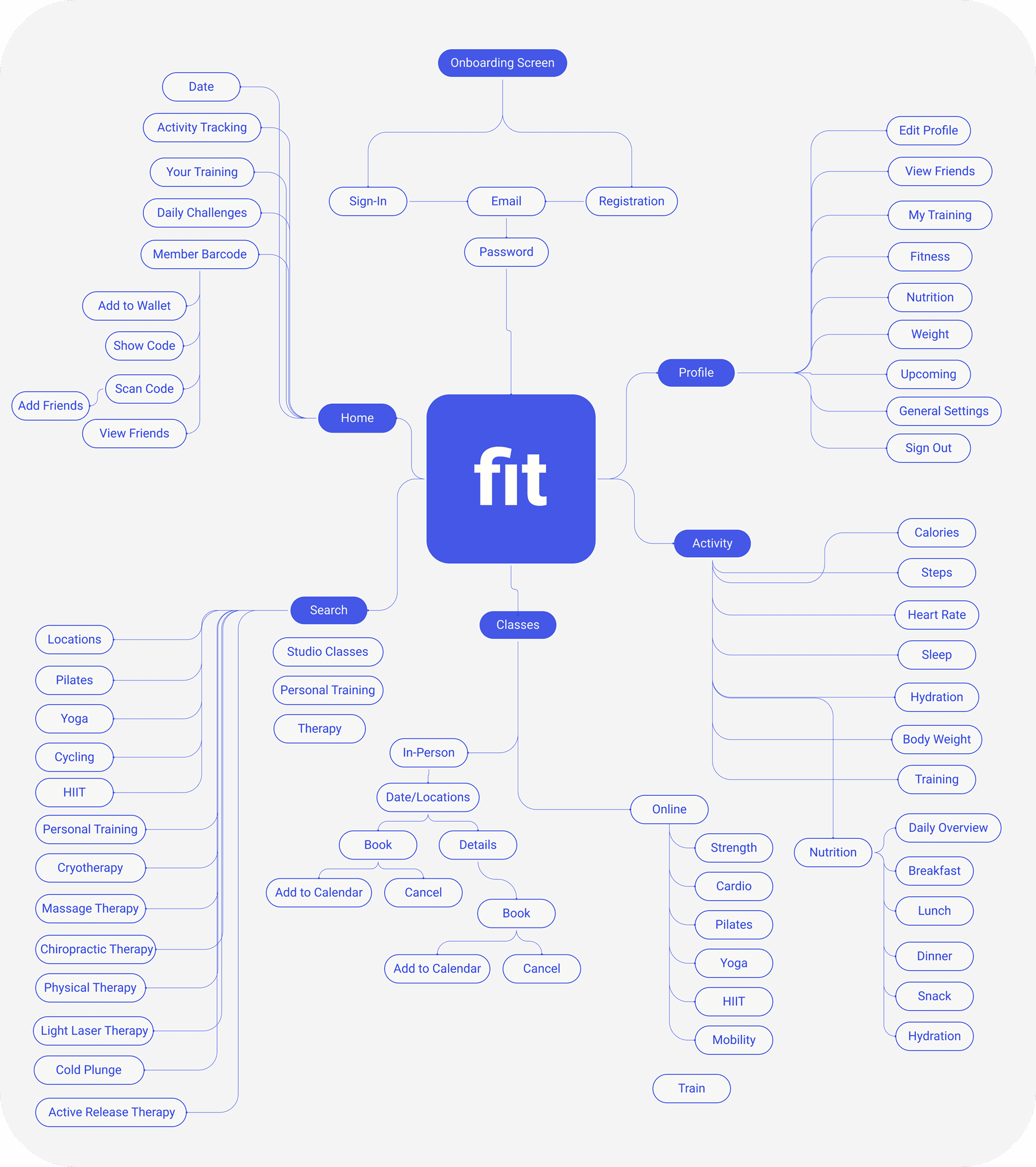
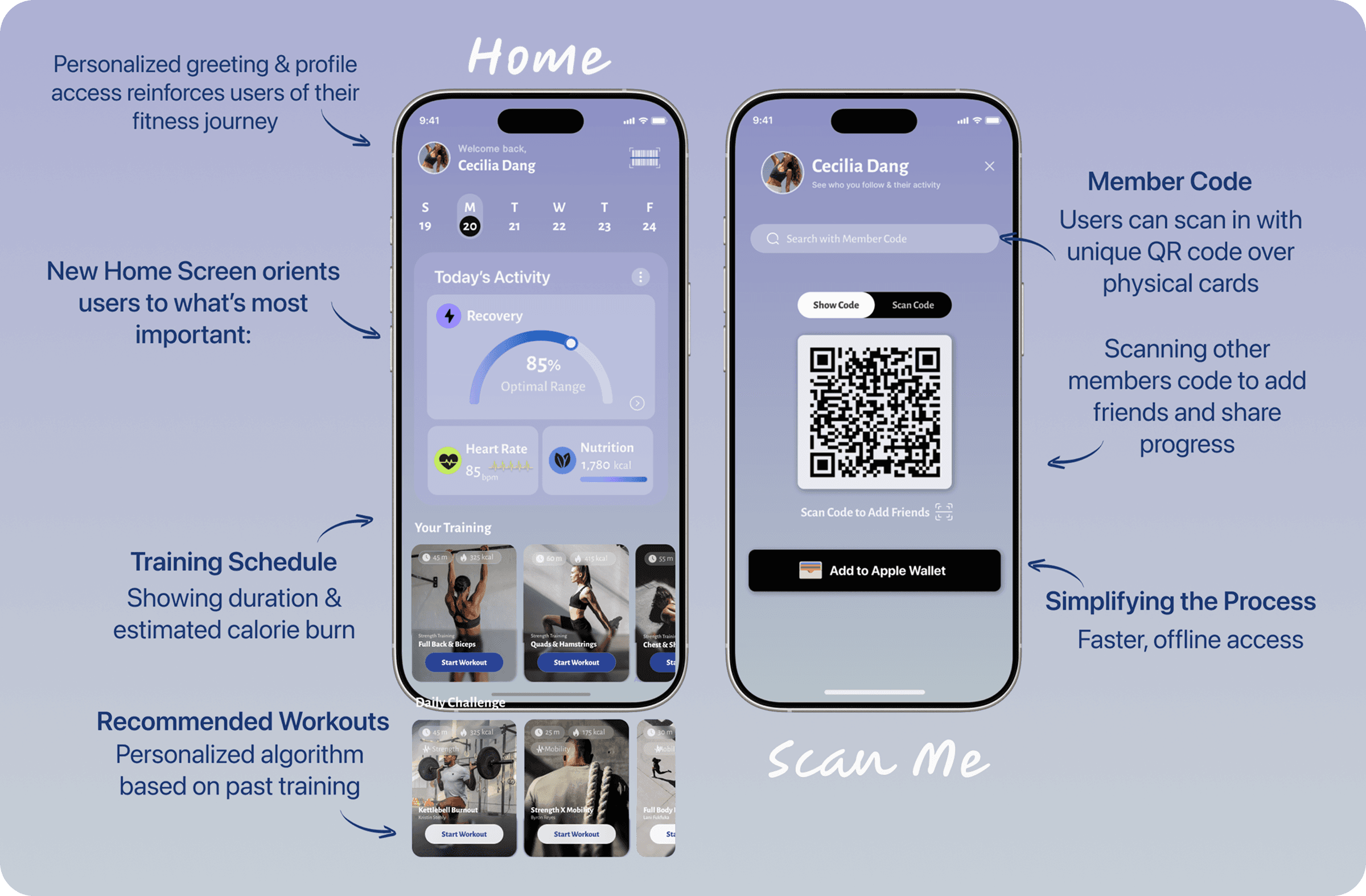
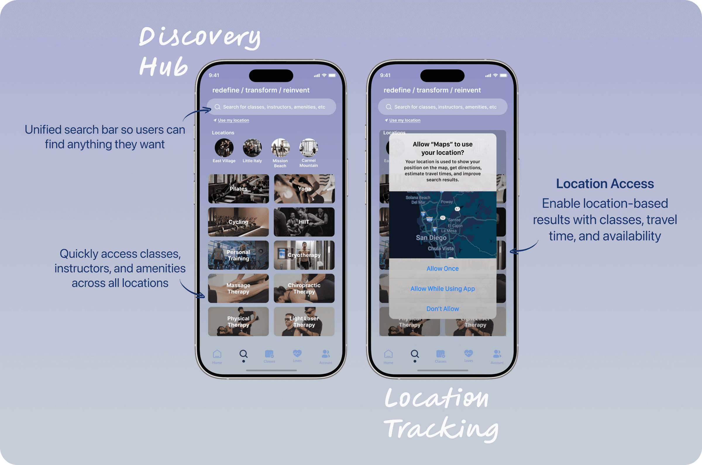
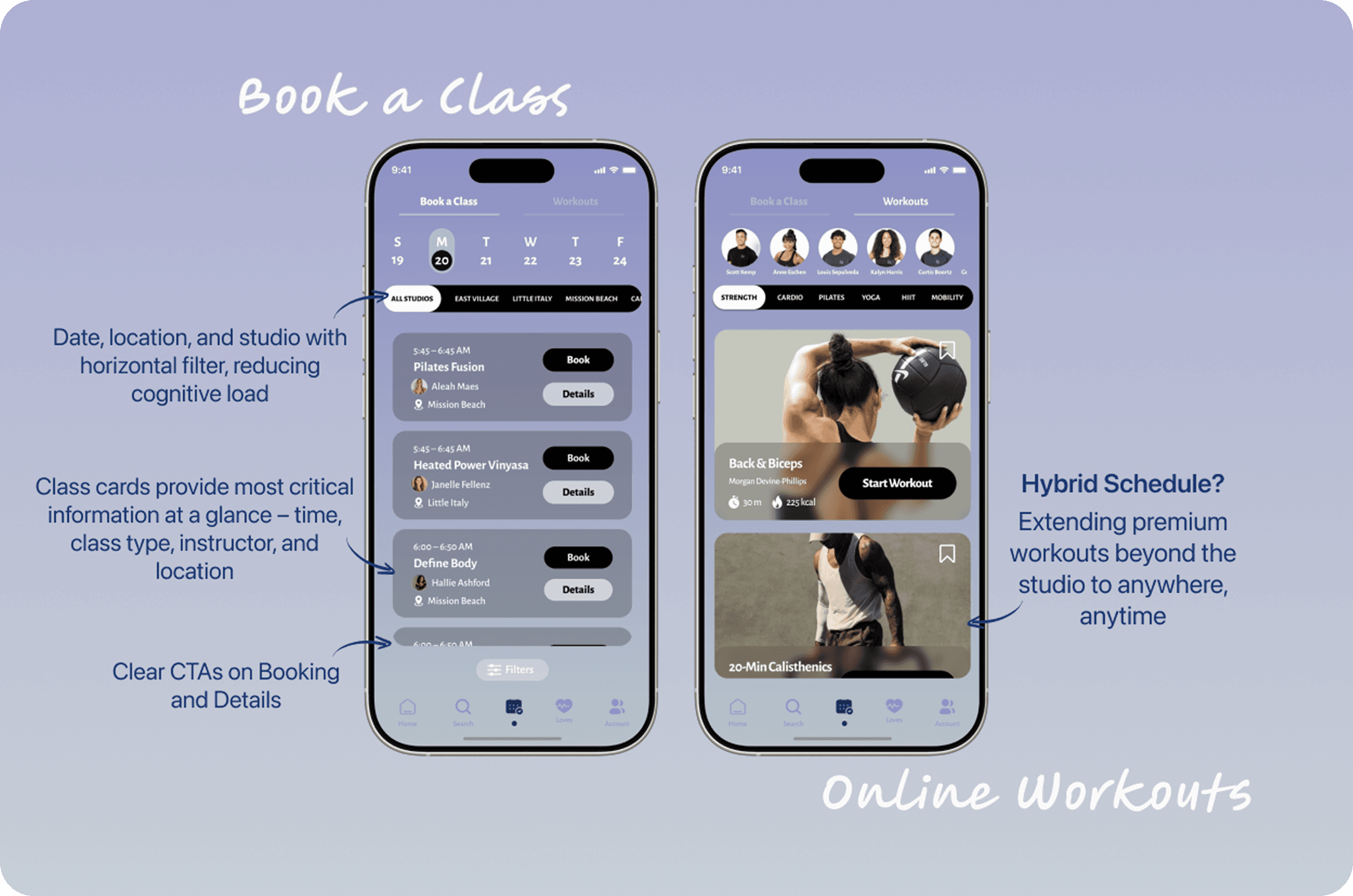
I designed a preliminary user flow to outline how users would complete key tasks, serving as a blueprint for the broader information architecture.
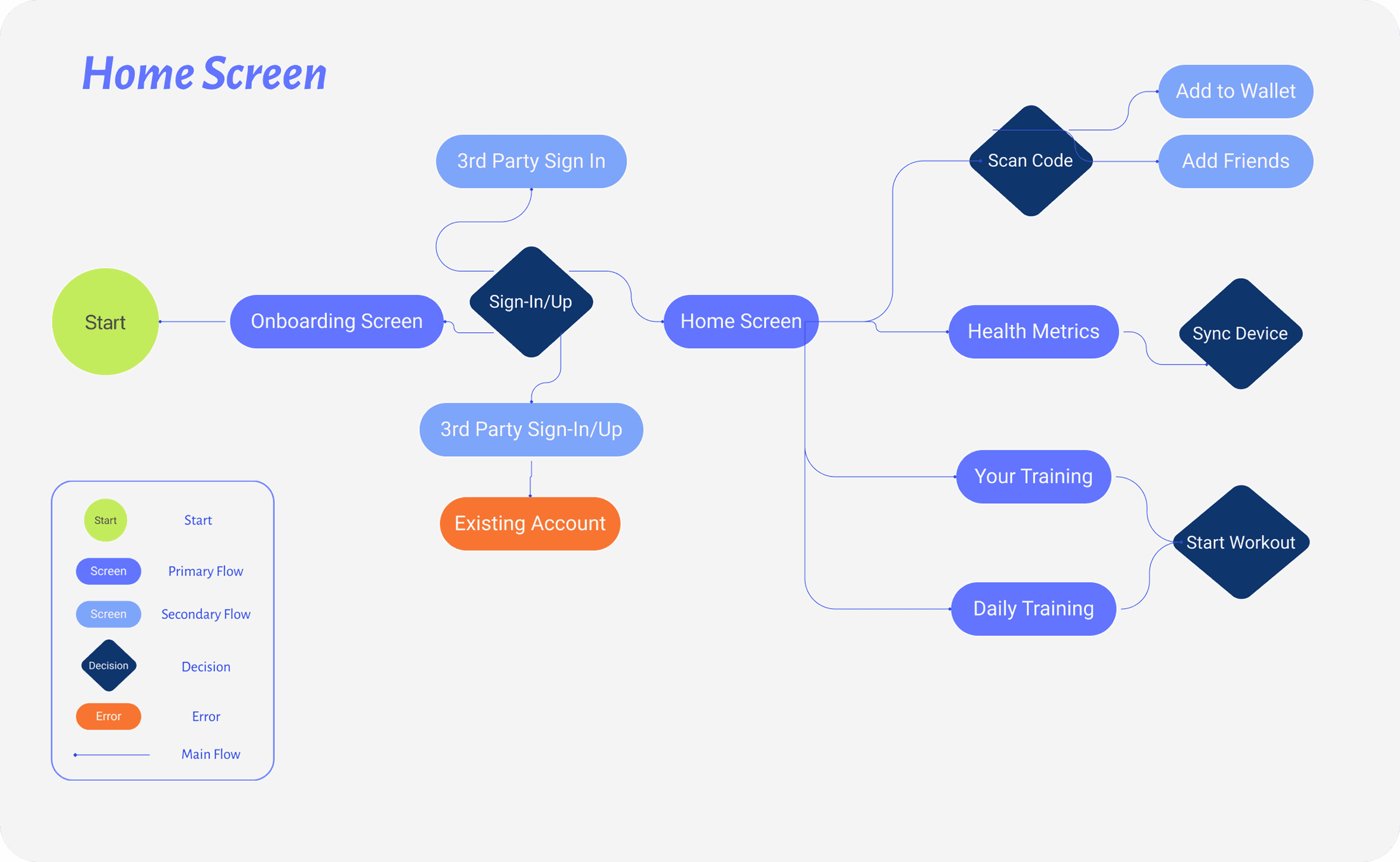
Sitemap
Pen to paper sketches were the best way for me to ground my designs and then use as a springboard once I was able to convert them into wireframes and prototypes. From there, I iterated directly on the prototypes.
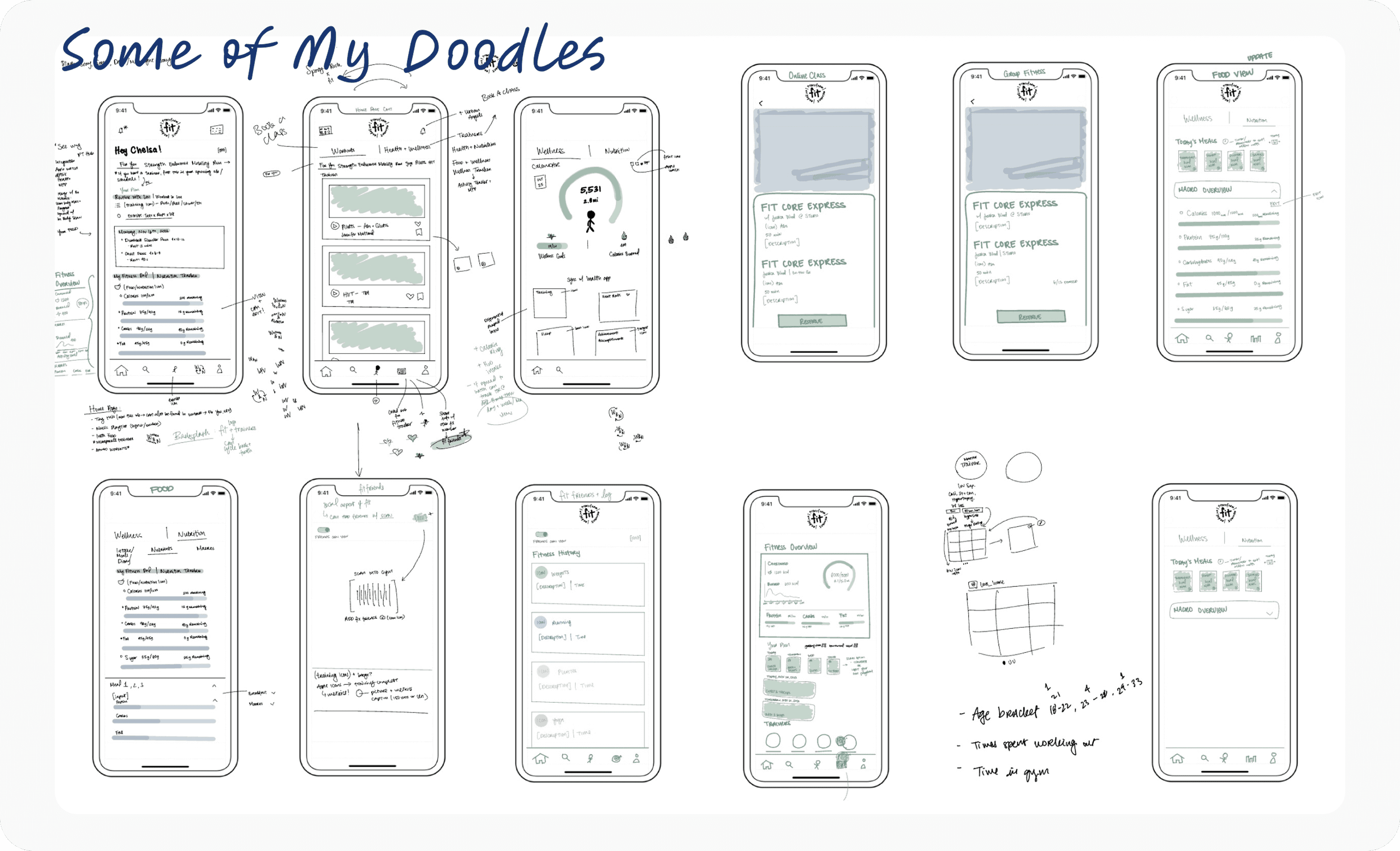
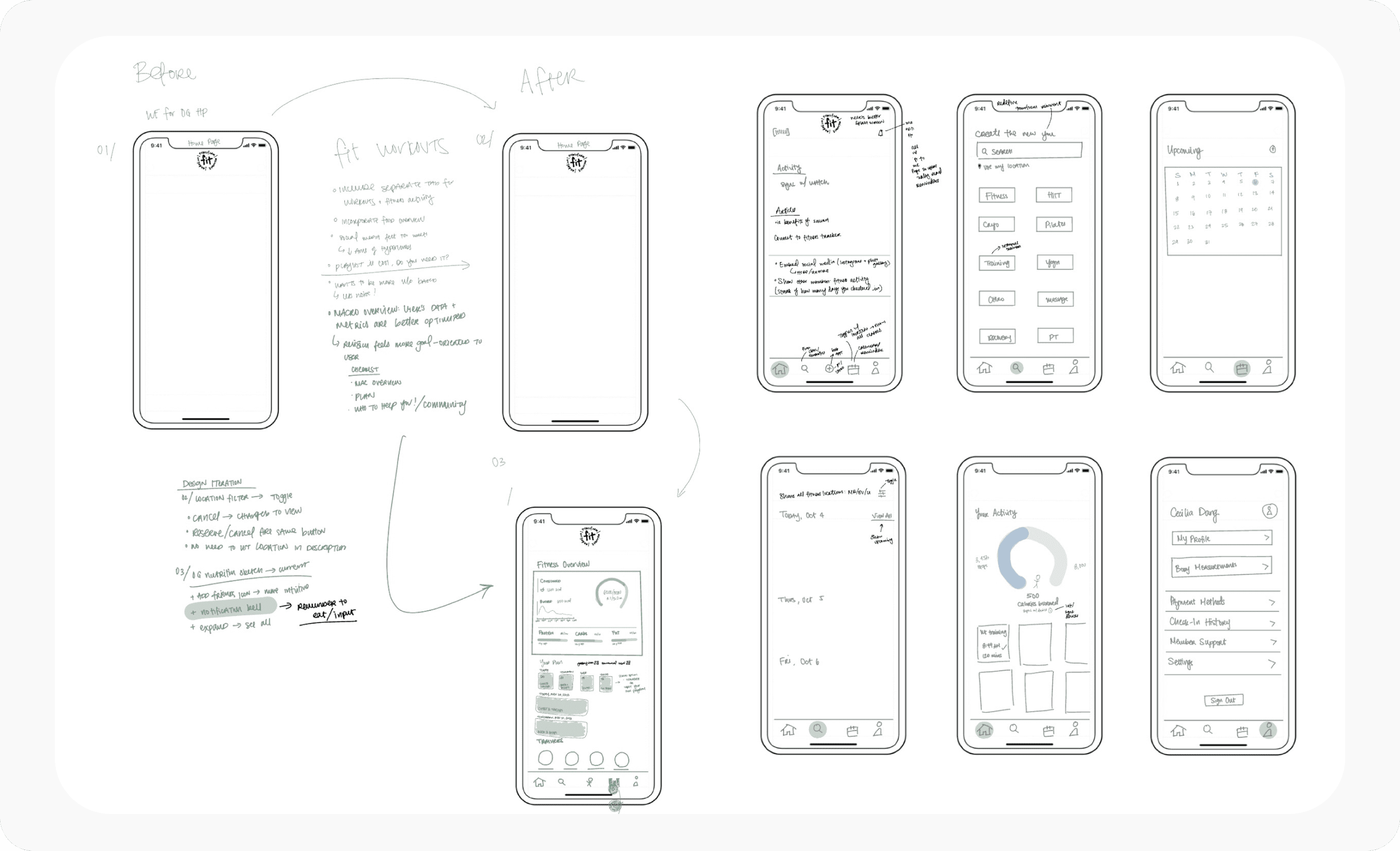
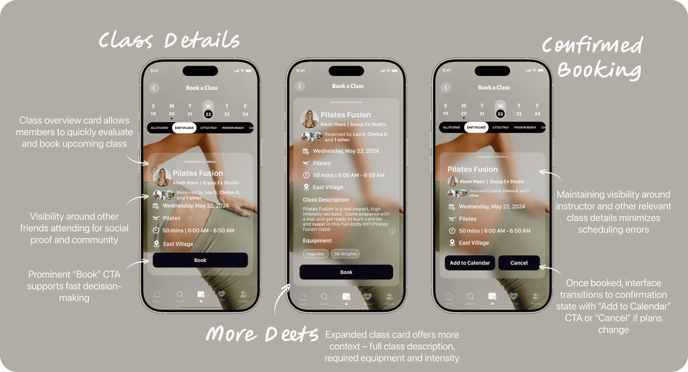
Low-to-Mid Wireframes & Mockups
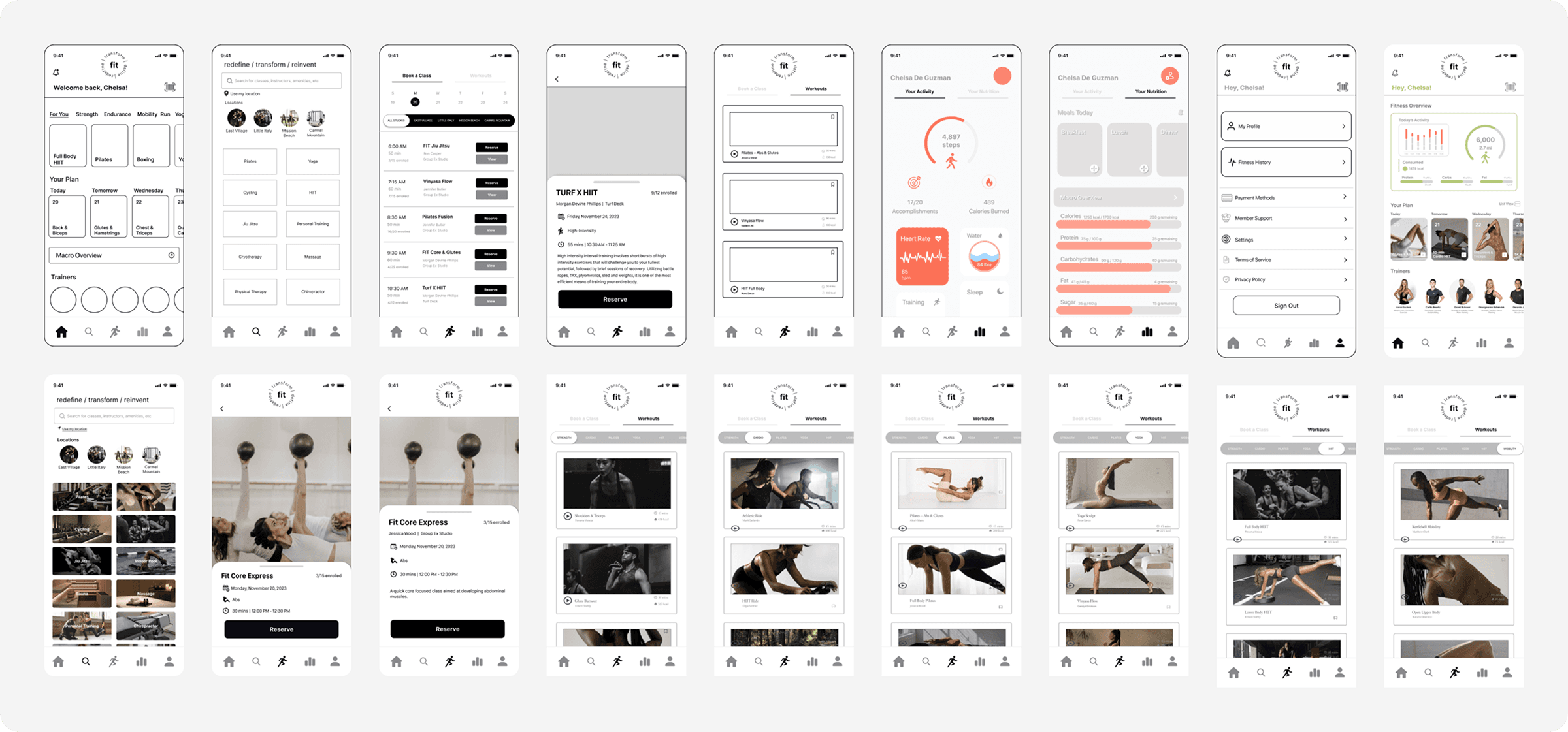
Hi-Fi Mockups
Typography & Color Palette
As of now, the evolving color system balanced bold minimalism with meaning: black to ground the interface, blue to establish trust, and purple to signal innovation. Typography included Inter for clarity and scalability, Alegreya Sans for warmth and personality, and SF Compact for dense, space-efficient instances.
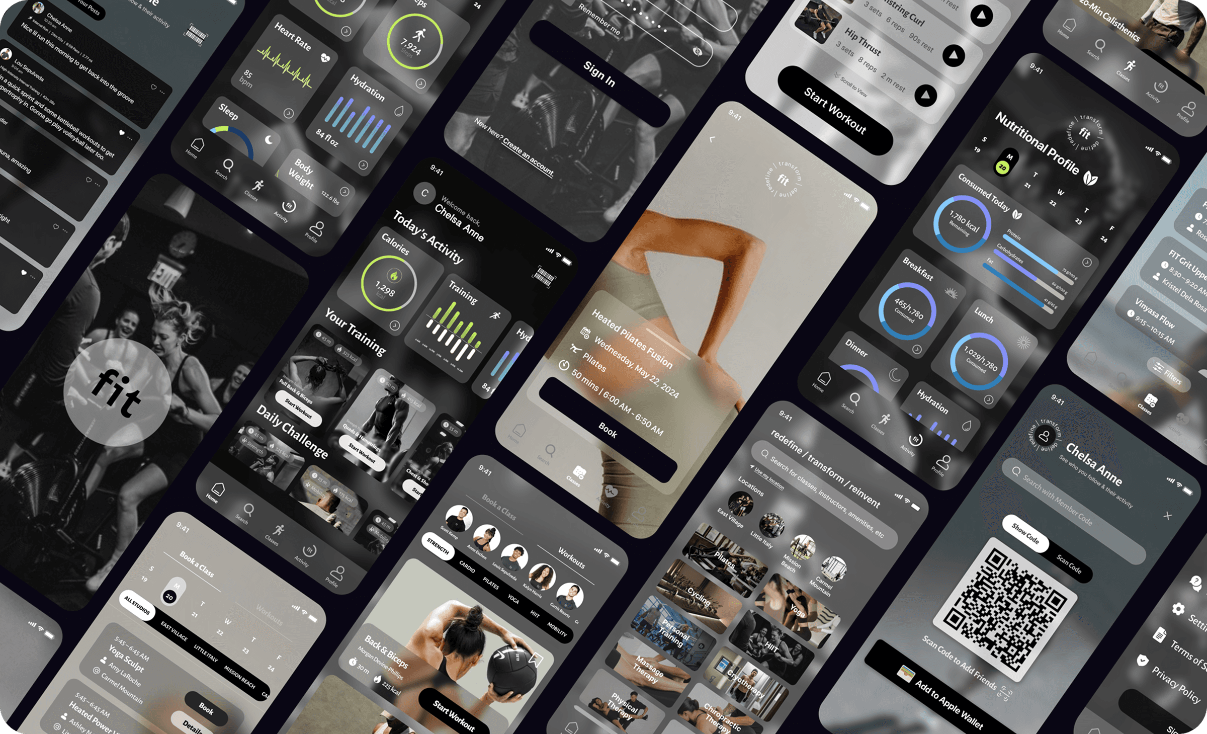
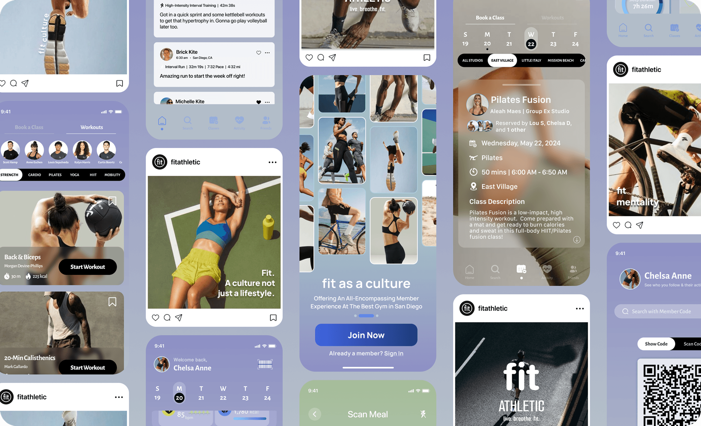
Hi-Fidelity Prototype 1.0: Monochrome Foundation
The first iteration explored a black, white, and grayscale palette aligned with Fit’s minimalist, performance-driven branding, allowing focus on hierarchy and interaction. Early feedback revealed accessibility issues and visual fatigue, and the palette ultimately felt too sterile to capture Fit’s energy and motivation.
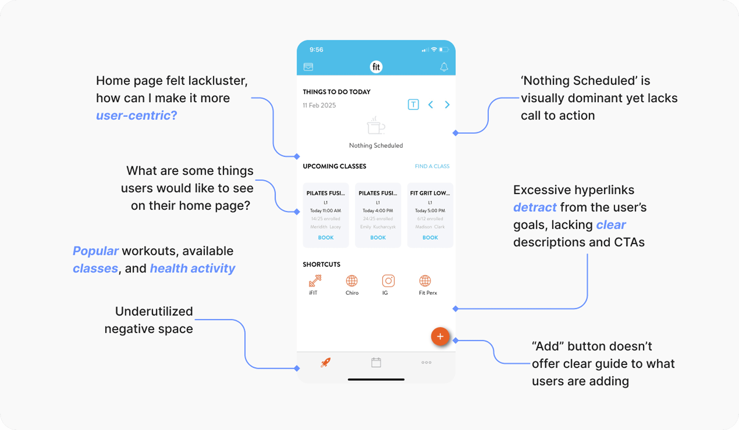
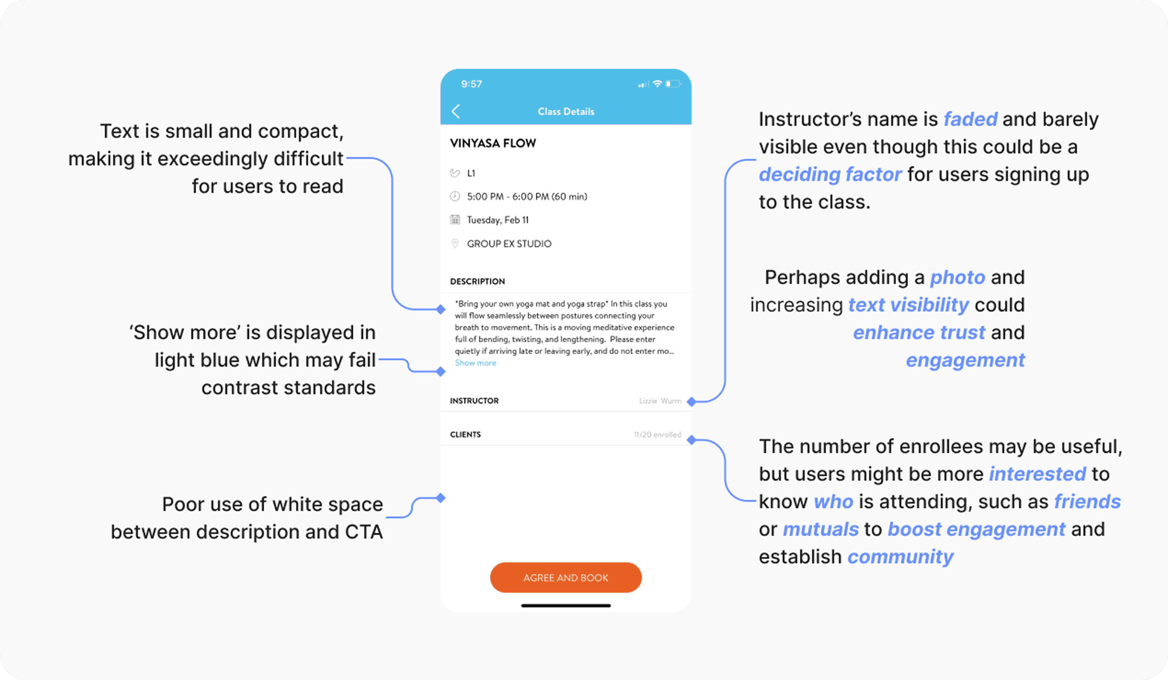
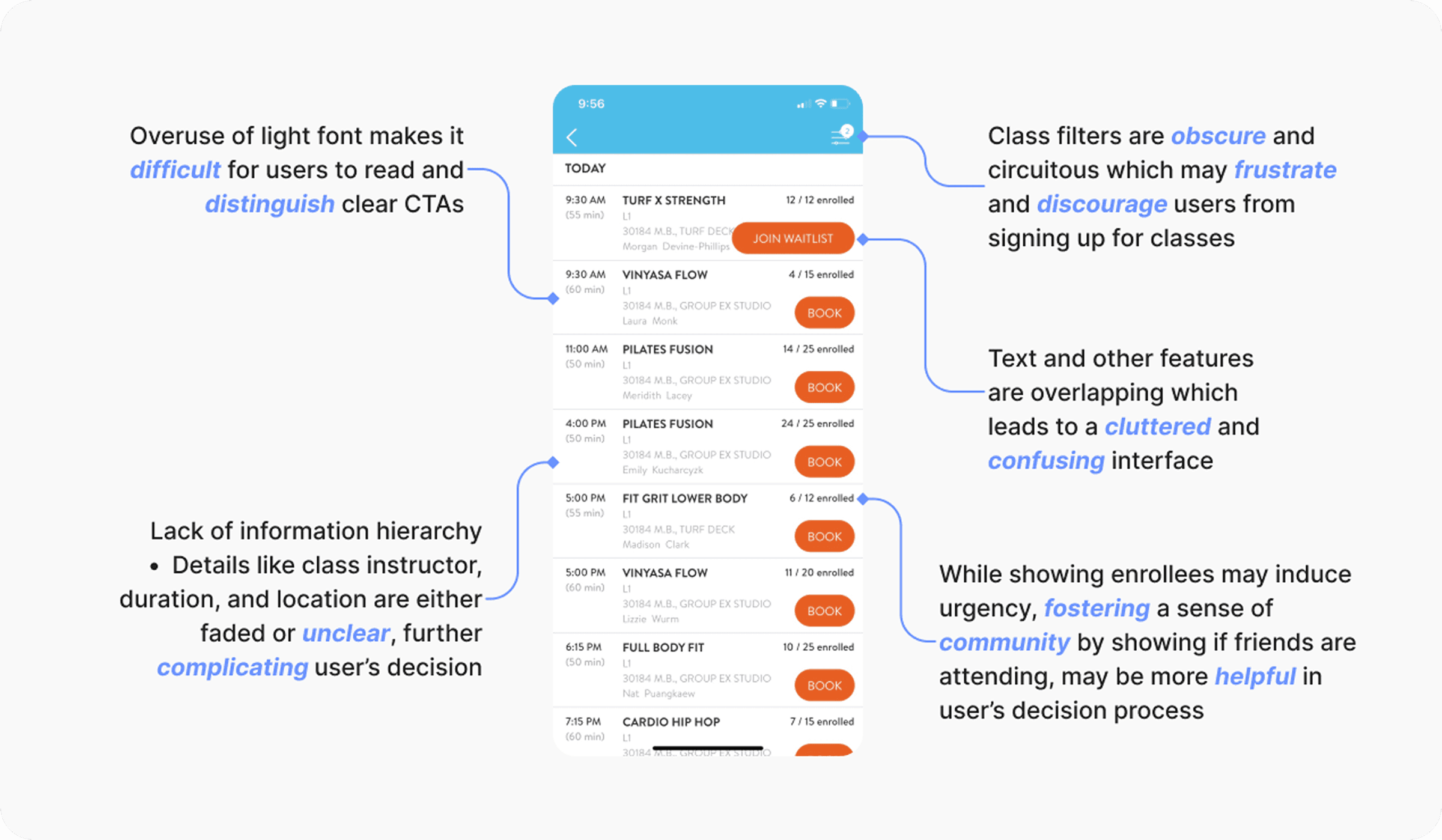
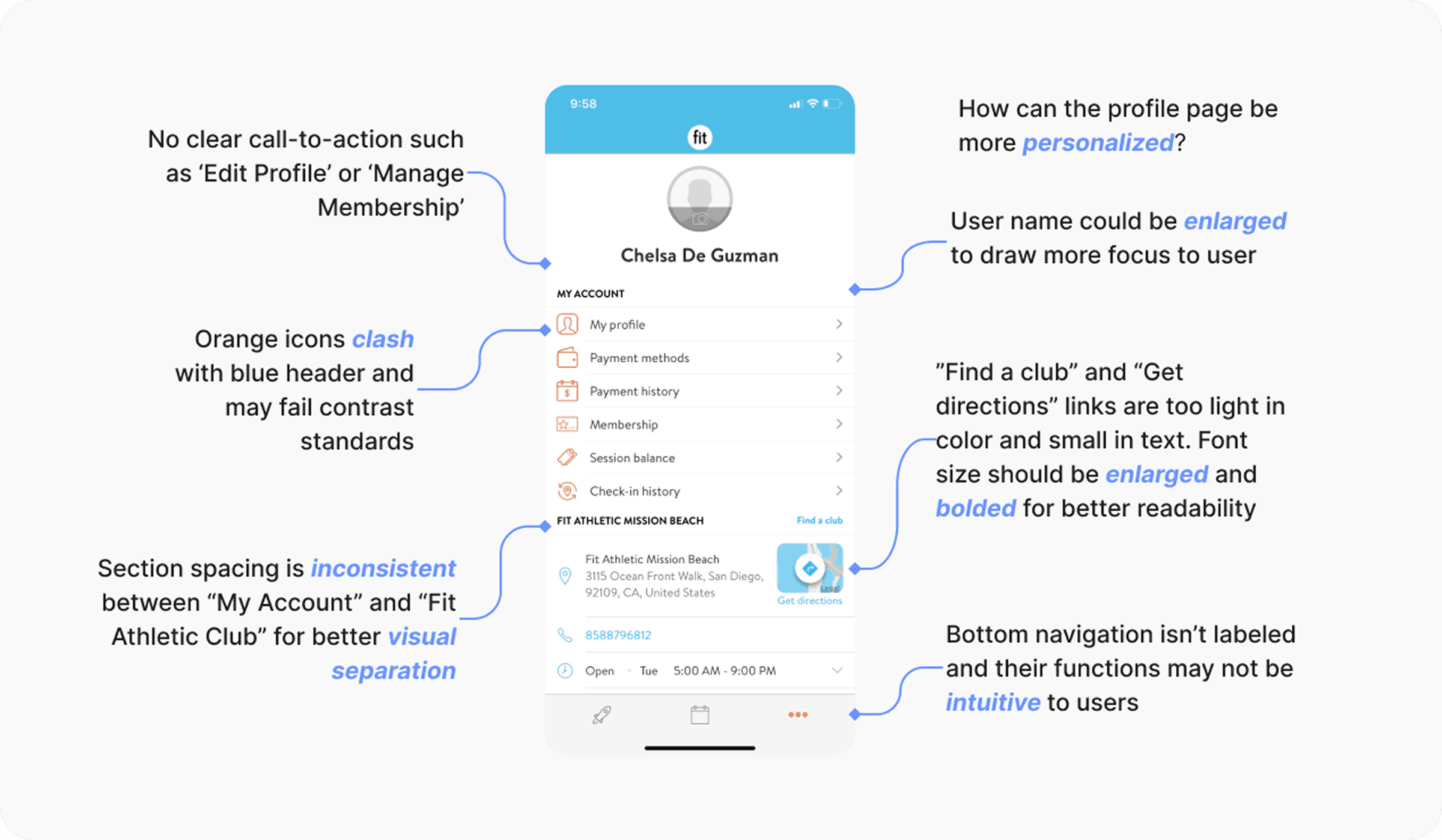
Usability Testing Overview
I conducted a usability testing with 8 Fit Athletic members with a focus on readability, navigation clarity, visual comfort, and task completion. The tasks included checking today's activity, booking a class, signing in via member code, adding friends, and reviewing health metrics.
Key Findings
75% of participants reported the interface felt "tiring on the eyes" after extended use
62% of particpants struggled to distinguish primary and secondary CTAs due to low contrast
71% of participants missed at least one primary CTA on their first attempt
50% of particpants hesitated to take any action when scanning data-heavy screens (health metrics, nutrition, and friends' posts)
50% of participants initiated the wrong task before course-correcting (78% without guidance)
Only 38% of participants described the design as intuitive and energizing
Prototype 2.0 & Pause
In the next phase, I introduced a blue-based color system to improve legibility, reduce eye strain, and create a calmer rhythm across data-heavy screens. While usability and accessibility improved, the interface began still leaned too clinical- functional, but lacking personality. Nonetheless, it was good enough for now.
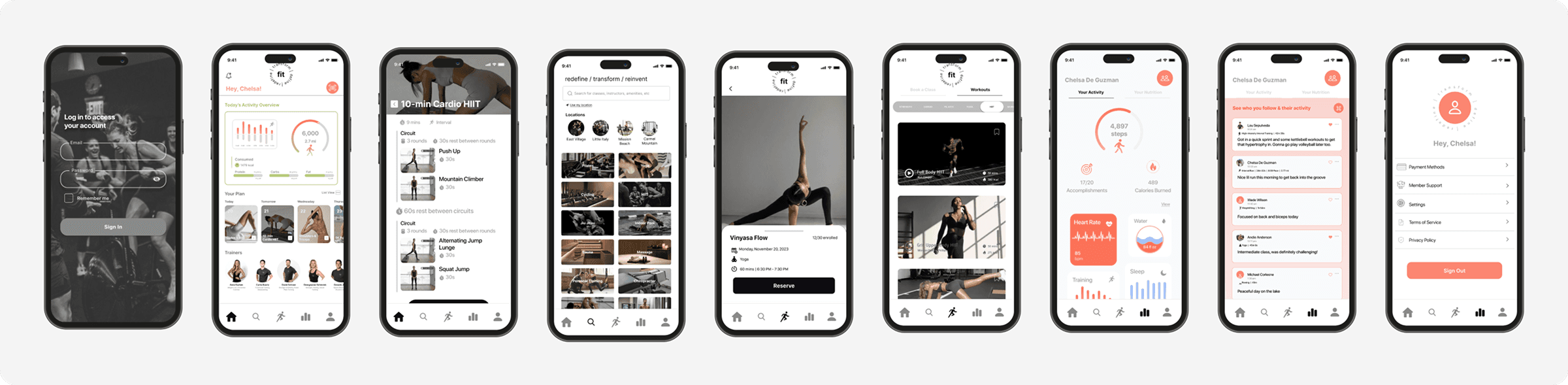
And this is where my journey took a pause and Fit was shelved for some time, but in the back of my mind, it was always there. And so when I got the opportunity to work on it again and present my work, I completely changed the baby blue backdrop. The design needed something darker, more ambient, but with undertones of strength and resilience through the subtle purple tones.
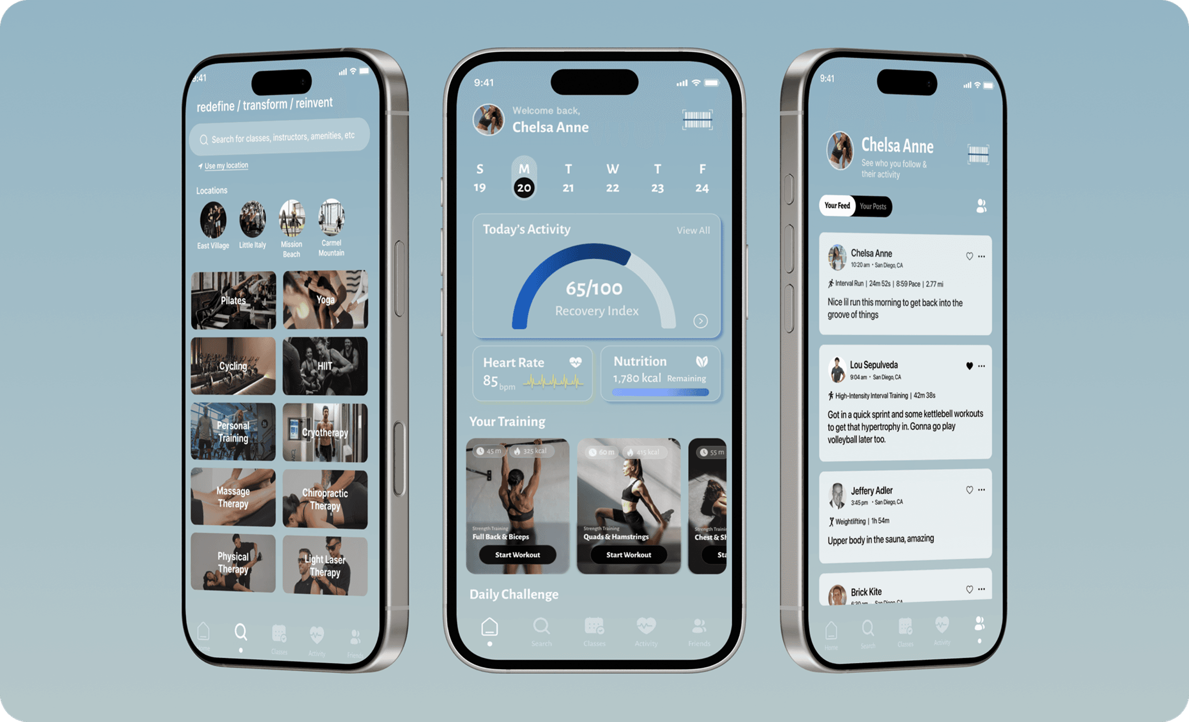
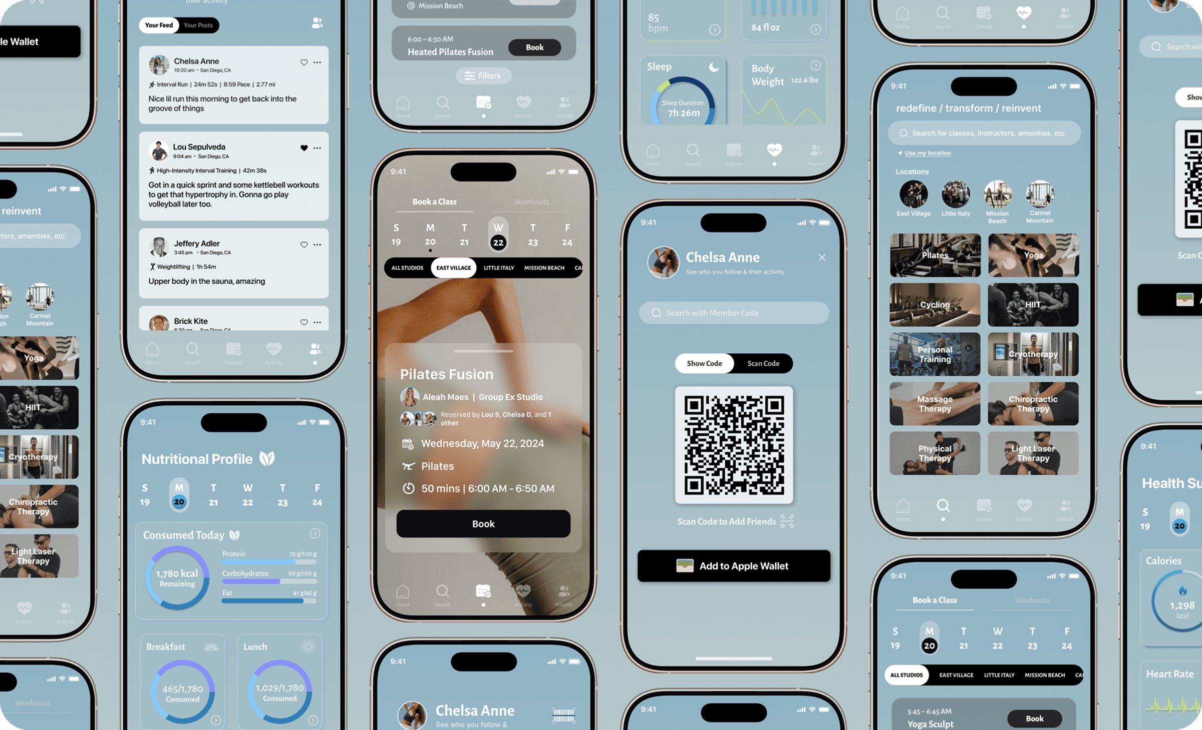
The Dawn/Dusk Iteration
Ultimately, I wanted to capture the feeling of those early morning workouts – when the light is just beginning to break and you’re already in motion. That quiet, powerful moment of rising before the world does, and the determination to keep going long after the sun goes down. I aimed to reflect that energy in the palette: calm yet bold, grounded yet full of momentum.
Click to try app prototype! 📱
User Testing & Key Insights
To evaluate whether the redesigned purple iteration resolved the usability and accessibility issues identified in earlier iterations, I conducted a final round of usability testing with the same 8 participants from previous studies. Using task-based scenarios and post-test surveys, I measured task success, clarity, visual comfort, and overall confidence across core flows. Insights from this round directly validated design decisions and informed final refinements outlined below:
Task success rate improved from 71% to 94%
Time to complete primary tasks decreased by 32% (averaging 3.9 seconds)
87% of participants preferred the final iteration over previous prototypes
100% of the participants described the layout as "calm" and "less intimidating than the black version"
Average time to locate class locations decreased by 32 seconds to 17 seconds
87% of participants booked the intended class on the first try
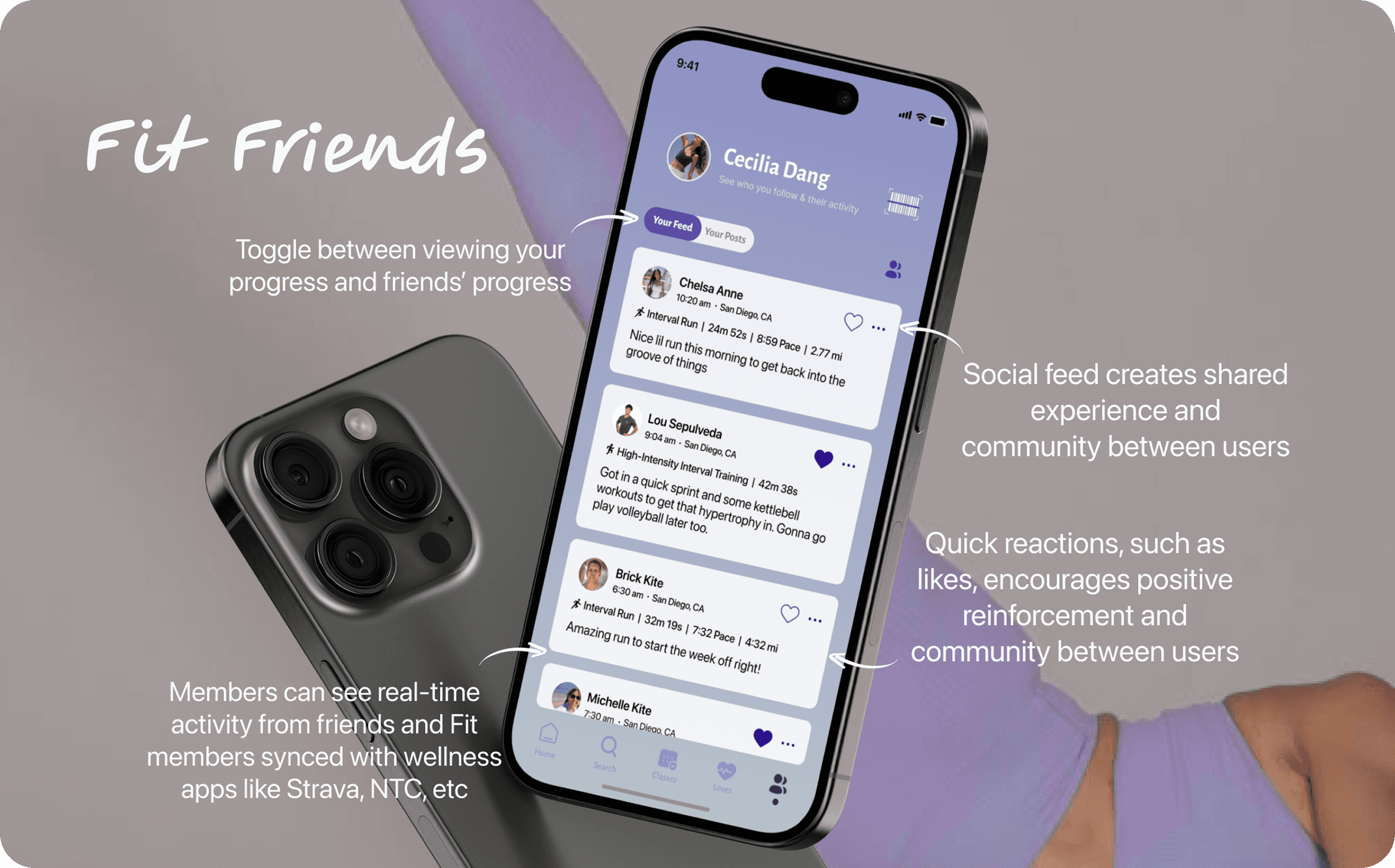
75% increase in interaction in Fit Friends (liking or commenting on posts)
Key Takeaways
From an initial 36-hour design sprint to three iterative refinements, returning to the drawing board was both bracing and freeing. Each round of usability testing re-centered the work on Fit members’ needs, shaping a solution that felt increasingly intuitive, cohesive, and aligned. The process was a testament to the non-linear process behind UX/UI.
What I'd Add Next
Add UI controls for contrast, text size, and motion reduction to maintain consistency across the board for members with visual sensitivity and improve accessibility
Build on existing health metrics with contextual insights like overtraining alerts and rest recommendations
Expand on personalized workouts, especially for female members with cycle syncing workouts
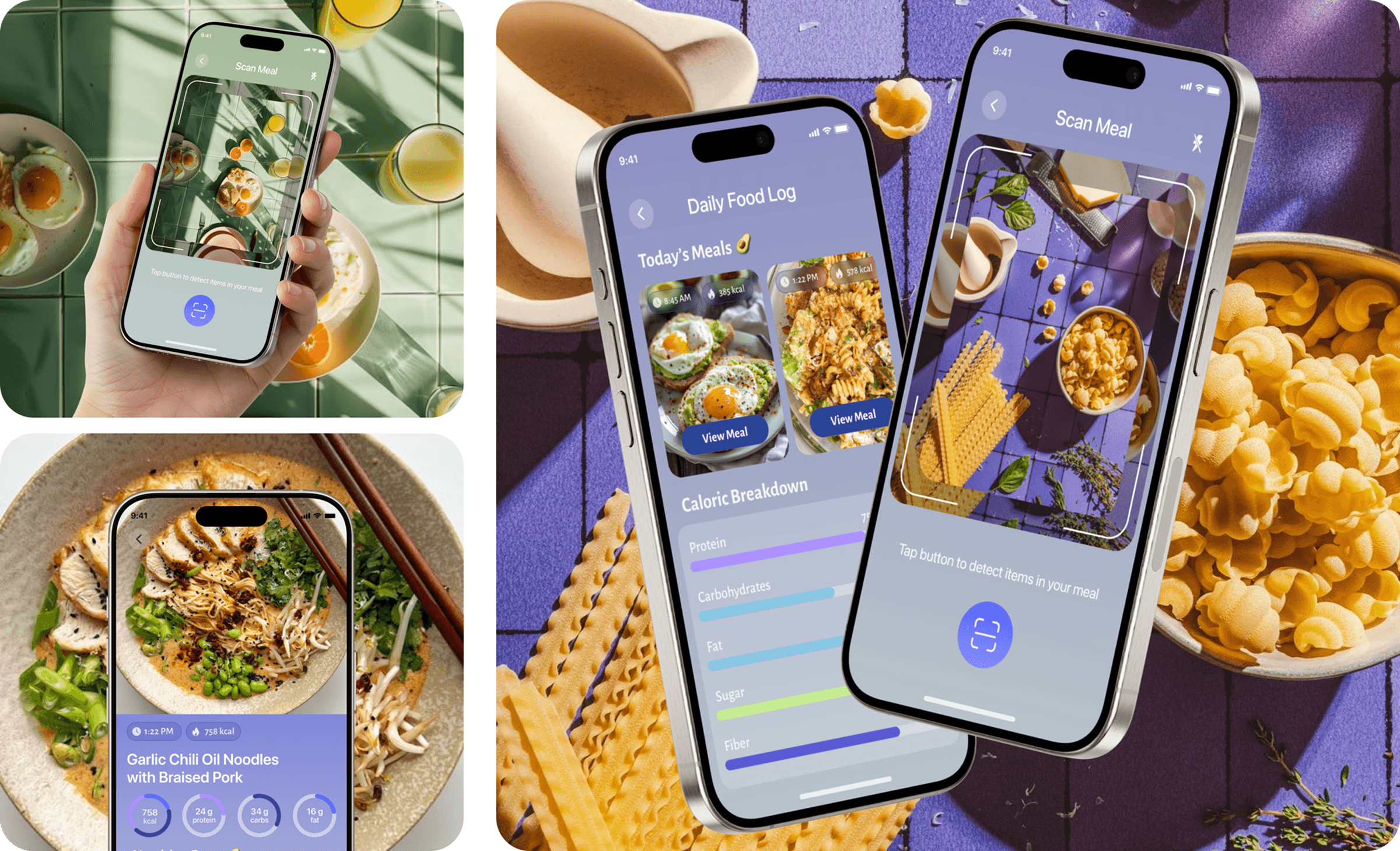
Further develop on nutrition, such as meal planning, to reinforce healthy habits outside of the gym