Reformation
I designed a first of its kind mobile app, featuring algorithmic styling suggestions and a curated, shoppable catalogue feed.
ROLE
UX/UI Designer, UX Researcher
TIMELINE
May 2023 – Oct 2023, revisited Aug 2025
TOOLS
Figma, Maze, Claude, Stitch
The dreaded, but inevitable browser crash
Picture this: You spot a cute top from Ref via Tiktok or Instagram reels, you click on the link to browse, you add to cart, you're in the middle of filling out your information when the browser suddenly crashes. The visual thread is snapped and you go on about your day.
The truth is, users rarely reach the "add to cart" stage because the browser typically crashes after ~184 seconds (a little over 3 minutes). Ref holds 3,171 items and counting.
Reformation's mobile web had real friction – I needed to see it myself first
A wishlist and quick checkouts on a mobile format were key differentiators between completed purchases vs abandoned carts
16 users discovered Reformation through social media and browsed on mobile, but abandoned purchases when experience broke down at checkout or post-purchase.
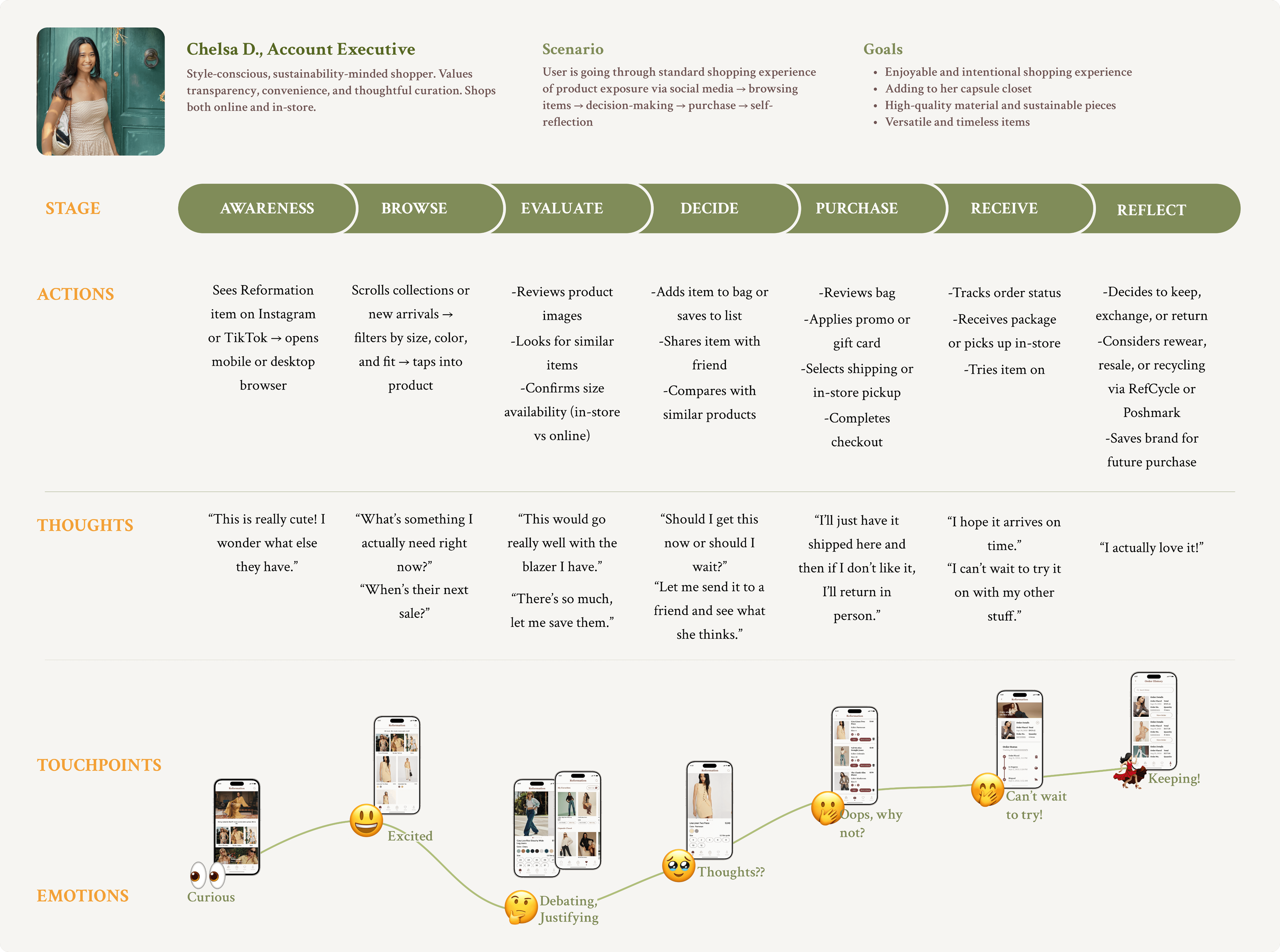
"I want a capsule closet with timeless pieces."
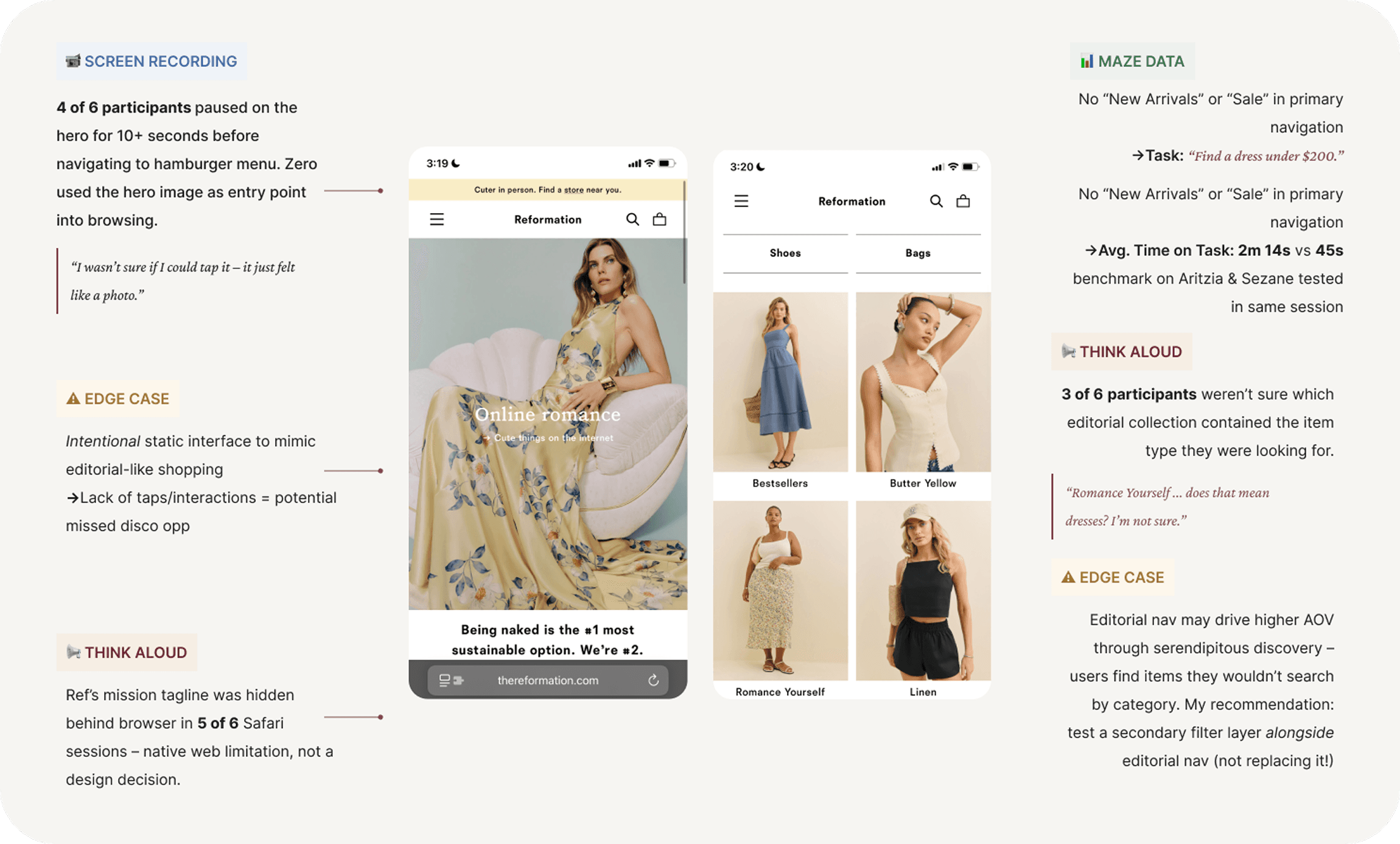
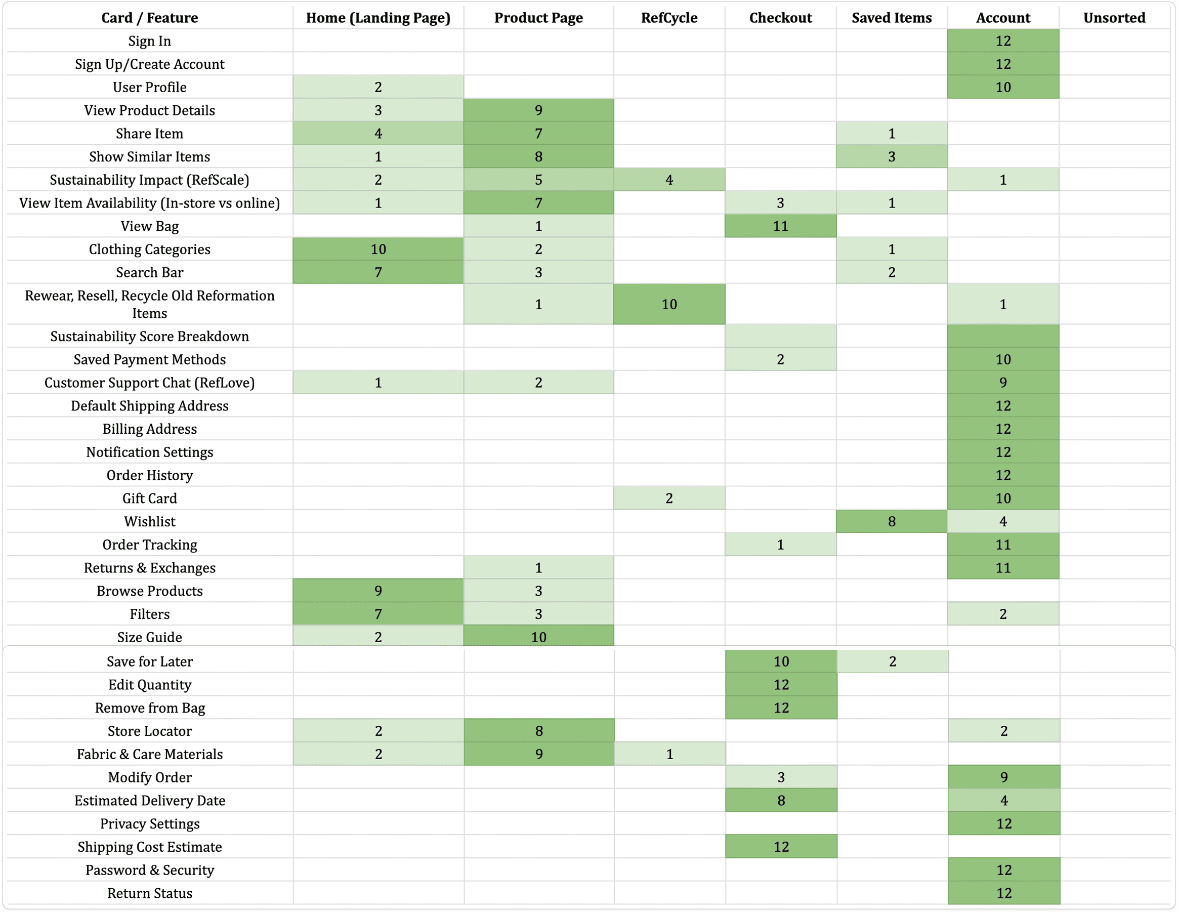
12 participants. Card sort confirmed users think in familiar mobile app patterns, which grounded the navigation structure.
Unique features like RefCycle and RefLove increased trust, showcasing Ref's commitment to sustainability and brand alignment even though the majority of users didn't touch them.
Users needed outfit context before they could commit
Click to try app prototype! 📱
Onboarding Flow, Simplified.
Testing revealed the ideal onboarding flow to be no more than 3-5 screens. I kept it at 2 and enabled features like Face ID to streamline the process.
Made to Feel Like You're Flipping Through A Catalogue
Users admire Ref's editorial feel so I designed the home page to simulate flipping through a catalogue, leaning into Ref's beautiful photography and minimal color palette.
Checkout Made Simple
Following user scans, I made the top decision makers like price (including tax and shipping) prominent and ensured features like editing cart, quantity, and moving items to wishlist didn't require users to abandon cart.
Favorites (aka Wishlist)
User testing revealed that wishlist items had a 67% of being purchased, so I added it to the navigation bar. Whether users are overwhelmed or underwhelmed, navigation bar is always a good baseline to reference.
Key Takeaways
What Did Reformation Teach Me About Designing for (Retail) Shoppers?
Every click between discovery and checkout is a decision point, and a drop-off risk. The question I kept returning to was: 'why does this product deserve your attention' and 'what are you actually here to do?' That tension shaped every design decision.
The wishlist was the clearest example. Only 20% of users revisited items they'd saved – it had become a dumping ground, not a decision tool. So I gave users named, organized lists instead. Utilization jumped 78% and revisit rate increased 41%.
The second gap was information density. When users spend $200+ on a single piece, they want to feel secure in their decision and most of all, good with their choices (no buyer's remorse) and these decisions come in the form of knowing fabric sourcing, care instructions, and sizing consistency – all without emailing customer service. The dread of finding a buried support line and waiting on a reply was enough to break the purchasing momentum. Bringing that information into the product wasn't a nice-to-have – it was the difference between buying and bouncing.
What I'd Continue
The checkout flow is still the biggest open question. Users could edit their cart, but I never fully tested what causes abandonment at that final, "Complete Purchase" step – was it hesitation, distraction, price shock, or all of the above? That's where I'd go next.